What Makes a Website Look Modern in 2025? Unpacking Key Design Trends
Ever wonder what makes a website look fresh and current these days? Well, as we head into 2025, things are changing fast in the online world. It's not just about pretty pictures anymore. We're talking about smart design that uses new tech, but still feels real and human. This article will break down the big ideas shaping how websites will look and feel, helping you understand What Makes a Website Look Modern in 2025?
Key Takeaways
- AI helps make websites easy to use, but designers are adding human touches so they don't feel cold.
- Simple, clean designs are still popular, but now they're even more focused on showing off content.
- Using 3D images and moving graphics makes websites more interesting and deep.
- Websites are telling stories as you scroll, making the experience more engaging.
- Some designers are bringing back bold, old-school looks with a modern twist, while others are going for a raw, edgy style.
The Rise of AI-Driven Design with a Human Touch

AI is changing web design, but it's not about robots taking over. It's more about blending AI's efficiency with human creativity. Think of it as AI handling the repetitive tasks, freeing up designers to focus on the emotional and strategic aspects of design. It's a pretty cool combo, actually.
Streamlined User Experience and Clarity
AI helps create super clear and easy-to-use websites. It can analyze user behavior to figure out the best layout and navigation. This means less clutter and more focus on what users actually want. For example, AI can help with user experience design by predicting where users will click next, making the whole experience smoother.
Balancing Efficiency with Emotional Resonance
AI can make things efficient, but it can't replace human empathy. The trick is to use AI to handle the technical stuff while still injecting personality and emotion into the design. It's about finding that sweet spot where the website is both functional and engaging. It's important to remember that AI is a tool, and like any tool, it's only as good as the person using it. Human expertise is still needed to ensure authentic content.
Integrating Human Touches in Automated Design
Here are some ways to add a human touch to AI-driven design:
- Use hand-drawn elements or illustrations.
- Incorporate personal stories or anecdotes.
- Choose colors and fonts that evoke specific emotions.
It's all about making the website feel less like a robot made it and more like a real person put their heart into it. Think about adding small details that show personality, like a quirky illustration or a handwritten font for a heading. These little things can make a big difference in how users connect with your site. You can also use user-friendly tools to help you with this.
Here's a simple table showing the impact of human touches:
| Feature | AI-Only | AI + Human Touch |
|---|---|---|
| User Engagement | Moderate | High |
| Brand Perception | Functional | Authentic and Relatable |
| Conversion Rates | Average | Above Average |
Next-Gen Minimalism: Intentional Silence and Space

Minimalism? Yeah, it's been around. But in 2025, it's not just about getting rid of stuff. It's about why you're getting rid of it. It's about intention. Think of it as design breathing room. It's about letting the content speak for itself without all the visual noise.
Stripping Away Excess for Content Focus
We're talking bare bones here. Get rid of anything that doesn't absolutely need to be there. Buttons? Streamline them. Images? Only use the ones that really matter. The goal is to make the content the star of the show. No distractions, just pure, unadulterated information. It's like decluttering your house, but for your website. You wouldn't want your dirty laundry to distract from your fancy new TV, would you?
Restrained Fonts, Colors, and Layouts
Think simple fonts – nothing too fancy. Colors? Keep it to a minimum. Maybe one or two accent colors, tops. Layouts should be clean and easy to follow. No crazy zig-zags or overlapping elements. It's all about creating a sense of calm and order. It's like a well-organized closet – everything has its place, and it's easy to find what you need.
Intuitive Navigation Through Deliberate Design
Navigation should be a no-brainer. Users should be able to find what they're looking for without even thinking about it. Clear labels, simple menus, and a logical site structure are key. It's like a well-designed map – you know exactly where you are and how to get where you're going.
Minimalism isn't about being boring. It's about being smart. It's about making conscious choices about what to include and what to leave out. It's about creating a user experience that is both efficient and enjoyable. It's about respecting the user's time and attention.
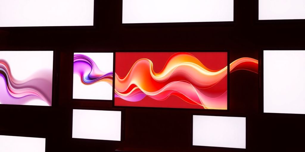
Immersive 3D and Motion Graphics
It's wild how much websites have changed. Remember when everything was just flat? Now, it's all about making things feel real. 3D and motion graphics are taking over, and honestly, it's pretty cool. It's not just about looking fancy; it's about making the whole experience more engaging. Websites aren't just pages anymore; they're becoming interactive environments.
Adding Depth to Flat Design
Flat design is fine, but let's be real, it can get boring. Adding 3D elements gives websites a whole new dimension. Think about product pages where you can rotate an item to see every angle. Or backgrounds that subtly shift as you scroll. It's all about creating a sense of depth that makes the site more interesting. It's not just for show, though. It can actually help users understand the product or service better. For example, a top website design can use 3D elements to showcase features in an engaging way.
Captivating Users with Interactive Elements
Motion graphics are another big part of this trend. We're not talking about cheesy animations from the early 2000s. These are smooth, subtle movements that guide the user's eye and make the site feel more alive. Hover effects, loading animations, and scroll-triggered animations can all add to the experience. The key is to make them interactive. Let users control the animations or explore 3D models. This keeps them engaged and makes the site more memorable. It's about creating a dynamic online experience, blending past aesthetics with new technologies, as seen in web design trends.
Optimizing Performance for Seamless Experiences
All this fancy stuff is great, but it's useless if the site takes forever to load. No one wants to wait around for a 3D model to render or an animation to finish. That's why optimizing performance is crucial. Here are some things to keep in mind:
- Compress images and videos.
- Use efficient code.
- Test the site on different devices.
The goal is to create a seamless experience for the user. If the site is slow or buggy, they're going to leave, no matter how cool the graphics are. It's a balancing act between visual appeal and technical performance. You don't want to sacrifice one for the other.
Here's a quick look at how different browsers handle 3D graphics:
| Browser | 3D Support | Performance | Notes |
|---|---|---|---|
| Chrome | Excellent | High | Generally the fastest for 3D rendering |
| Firefox | Good | Medium | Can be slower with complex scenes |
| Safari | Good | Medium | Optimized for Apple devices |
| Edge | Excellent | High | Similar performance to Chrome |
Interactive Scroll-Based Storytelling
Websites in 2025 aren't just about information; they're about experiences. And what better way to create an experience than through a story? Interactive scroll-based storytelling is all about guiding users through a narrative as they scroll down the page. It's like turning a website into a digital book, where each scroll reveals the next chapter.
Engaging Users Through Narrative Journeys
The key here is engagement. Instead of passively reading text, users become active participants in the story. Think about it: as you scroll, images animate, text fades in, and maybe even sound effects play. It's a multi-sensory experience that keeps you hooked. This approach is especially effective for brands that want to tell their story or explain complex concepts in an easy-to-digest way. It's not just about pretty visuals; it's about crafting a compelling narrative that resonates with the user. This is a great way to design engaging narrative experiences.
Dynamic Content Unfolding on Scroll
This isn't your grandma's website. We're talking about dynamic content that changes and adapts as you scroll. Parallax scrolling, where background images move slower than foreground elements, creates a sense of depth. Animations can trigger when elements come into view, drawing attention to key information. It's all about creating a sense of discovery and surprise. The goal is to make the user feel like they're exploring something new with each scroll. It's a bit like a digital scavenger hunt, where the reward is a better understanding of the content. This is a great way to improve website layouts.
Creating Memorable User Experiences
Ultimately, interactive scroll-based storytelling is about creating memorable user experiences. People remember stories, and they remember how they felt while experiencing them. By crafting a compelling narrative and using dynamic content, you can create a website that sticks with users long after they've left. It's about more than just conveying information; it's about creating an emotional connection. And in a world where attention spans are shorter than ever, that connection is more important than ever. Consider how user interaction can be improved with this approach.
Think of it as directing a movie, but instead of scenes, you're directing sections of a webpage. Each scroll is a cue for the next scene to unfold, revealing more of the story and drawing the user deeper into the experience. It's a powerful way to communicate your message and leave a lasting impression.
Retro Maximalism: Analog Energy in a Digital Age
Retro Maximalism is making a comeback, and honestly, I'm here for it. After years of clean, minimalist designs, people are craving something with a bit more personality. It's like everyone suddenly remembered the joy of bold colors and quirky patterns. This trend is all about bringing back the warmth and nostalgia of the pre-digital era.
Embracing Bold Shapes and Layered Visuals
Think 1970s psychedelia meets early 1990s pop culture. We're talking bold geometric shapes, saturated colors, and layered visuals that create a visually rich experience. It's about creating designs that are energetic and full of life. It's a rebellion against the sterile minimalism that has dominated the web for so long. You can see this in action with vibrant visuals that really pop.
Infusing Nostalgia with Modern Aesthetics
It's not just about throwing a bunch of retro elements together. It's about blending that nostalgic feel with modern design principles. Think chunky retro typefaces, pixelation, and grainy textures, but with a contemporary twist. It's about tapping into those collective memories of a simpler time while still creating something fresh and new. It's like remixing your favorite old song with a modern beat. This approach helps in website design by making it more relatable.
Creating Visually Rich and Unique Designs
This trend is all about creating designs that stand out. It's about embracing imperfections and creating something that feels authentic and real. It's a chance to experiment with different textures, colors, and shapes to create something truly unique.
It's about creating designs that are not only visually appealing but also emotionally engaging. It's about tapping into the power of nostalgia to create a connection with your audience.
Here are some elements you might see:
- Bold, saturated color palettes
- Chunky, retro fonts
- Grainy textures and pixelation
- Layered visuals and geometric shapes
Neo-Brutalism: Raw, Edgy, and Unapologetic
Neo-Brutalism is all about breaking the rules of conventional web design. It's a style that isn't afraid to be bold, confrontational, and unfiltered. Think of it as the design equivalent of a punk rock anthem – loud, in your face, and definitely not trying to please everyone. It's about showcasing digital authenticity, even if it means things get a little rough around the edges.
Showcasing Unfiltered Digital Authenticity
Neo-Brutalism throws polish out the window. It embraces raw textures, harsh visual contrasts, and even system-default fonts. It's like the design equivalent of showing up to a fancy party in ripped jeans – unexpected and maybe a little shocking, but undeniably real. This style is perfect for brands that want to project an image of honesty and transparency. For example, a website that uses jarring graphic blocks and a utilitarian layout can feel more functional than ornamental.
Bold Typography and Unconventional Layouts
Forget everything you know about perfect alignment and harmonious color palettes. Neo-Brutalism thrives on asymmetry, clashing colors, and typography that screams for attention. We're talking oversized fonts, unusual kerning, and a general disregard for traditional design principles. It's a visual rebellion, and it's meant to make you stop and take notice. Some key elements include:
- Overlapping elements
- Broken grids
- Inconsistent spacing
Challenging Traditional Design Norms
Neo-Brutalism isn't just a style; it's a statement. It challenges the idea that websites need to be sleek, polished, and user-friendly. It's about pushing boundaries, experimenting with new ideas, and creating designs that are as unique and individual as the brands they represent. It's a rejection of the status quo, and it's a reminder that effective web design can be more than just pretty pictures and smooth animations. It's about creating an experience that's memorable, thought-provoking, and maybe even a little bit uncomfortable. It's about website design trends that are bold and innovative.
Neo-Brutalism is not about being ugly for the sake of being ugly. It's about using unconventional design elements to create a sense of authenticity and rawness. It's about challenging the viewer and making them question their assumptions about what good design should look like.
Prioritizing Accessibility and Inclusivity
Designing for Diverse User Needs
Website design in 2025 isn't just about looking good; it's about working for everyone. This means actively considering the needs of users with disabilities, different cultural backgrounds, and varying levels of technical expertise. It's about moving beyond compliance and embracing empathy in design. We need to think about how people actually use the web, not just how we think they do. This approach ensures that the digital world is accessible and welcoming to all, not just a select few. It's about creating a more equitable online experience.
Ensuring High Contrast and Readability
Readability is key. It doesn't matter how amazing your content is if people can't actually read it. High contrast between text and background is a must, and font choices matter more than ever. Think about users with visual impairments or those browsing in bright sunlight. Simple, clear fonts are always a good bet. Avoid overly stylized fonts that can be difficult to decipher. Here are some things to keep in mind:
- Use a contrast ratio of at least 4.5:1 for normal text.
- Choose fonts that are easy to read at various sizes.
- Provide options for users to adjust text size and font.
Accessibility isn't just a nice-to-have; it's a necessity. By prioritizing readability, we make the web a more inclusive place for everyone.
Utilizing Assistive Technologies for Broader Reach
Assistive technologies are becoming increasingly sophisticated, and websites need to be designed to work seamlessly with them. This includes screen readers, voice recognition software, and other tools that people with disabilities use to access the web. Proper semantic HTML is crucial for SEO best practices, as it helps assistive technologies understand the structure and content of a page. Alt text for images is also essential, providing descriptions for users who can't see them. By embracing these technologies, we can create websites that are truly accessible to all. It's about understanding how people with disabilities interact with the web and designing accordingly. Investing in accessibility services is not just ethical, it's smart business.
Making sure everyone can use and enjoy your website is super important. It's about building a web that works for all, no matter their abilities. Want to learn more about how we make websites easy for everyone to use? Check out our services!
Conclusion
So, what does all this mean for websites in 2025? It's pretty clear that things are moving towards a mix of cool new tech and making sure everyone can use the internet easily. If you're building a website, or just trying to keep yours looking fresh, you'll want to think about these ideas. It's about making something that looks good, works well for people, and is ready for whatever comes next. Staying on top of these changes will definitely help your website get noticed in the online world.
Frequently Asked Questions
What makes a website look modern in 2025?
Modern websites in 2025 will look fresh by mixing smart computer help with a personal touch. Think of designs that are simple but also have cool 3D effects, fun scrolling stories, and sometimes even a throwback look. It's all about making websites easy to use and interesting to look at.
How does AI change website design?
AI helps make websites super easy to use and clear. It can suggest layouts and ideas that are simple and clean. But designers will add human feelings and personality to these AI-made parts so the website doesn't feel cold or robotic.
What is 'Next-Gen Minimalism'?
Minimalism in 2025 means using lots of empty space and keeping things very simple. It's about letting the main message or pictures really stand out. Less stuff on the page means users can focus better on what's important.
Why are 3D and motion graphics important?
3D and moving pictures make websites feel more real and exciting. Instead of flat images, you might see things pop out or move around, which grabs your attention and makes the website more fun to explore.
What is interactive scroll-based storytelling?
This is like telling a story as you scroll down a page. Different parts of the story or new information appear as you move your mouse, making it a fun journey instead of just reading text.
What is 'Retro Maximalism'?
This trend brings back old-school cool, like bold shapes and lots of layers, but with a new twist. It's about using bright colors and busy designs to make a website feel unique and memorable, like a piece of art.


Comments
Post a Comment