Minimalism vs. Maximalism in Web Design: Unpacking the Impact on Your Brand's Success
Choosing how your website looks is a big deal for your brand. It's like picking out an outfit for a job interview – it needs to say the right thing. Two main styles are minimalism and maximalism. One is all about keeping things simple and clean, while the other goes for a bold, full-of-stuff look. We're going to break down what each one means and how it can affect whether people like your brand and, you know, buy from you. So, let's figure out which one is the best fit for your brand's success.
Key Takeaways
- Minimalism focuses on simplicity, clean lines, and white space, often conveying sophistication and confidence in product quality. It appeals to a discerning audience by highlighting what's truly important.
- Maximalism embraces bold colors, rich visuals, and lots of detail to grab attention, create strong brand differences, and build emotional connections with consumers.
- The choice between minimalism and maximalism should align with your brand's core identity, what you're selling, and who you're trying to reach. There's no one-size-fits-all answer.
- Effective minimalist design uses color and space wisely, focuses on clear content and type, and features high-quality images. It's about being intentional with every element.
- Successful maximalist design uses striking colors and fonts, incorporates interesting visuals, and balances its complexity to ensure a good user experience, making the brand memorable.
Understanding Minimalism vs. Maximalism in Web Design
When we talk about web design, two big styles often come up: minimalism and maximalism. They're pretty much opposites, and how you choose between them can really shape how people see your brand. It's not just about looks; it's about the whole vibe you put out there.
The Core Principles of Minimalist Design
Minimalism in web design is all about stripping things back to the essentials. Think clean lines, lots of open space, and a focus on what truly matters. The idea is to remove anything that doesn't serve a purpose, making the user experience super straightforward. It often uses a limited color palette, usually with a lot of white or neutral tones, and relies on simple, clear typography. The goal is clarity and a sense of calm. It’s like decluttering your digital space so the important stuff can shine.
Here are some key ideas behind minimalist design:
- Simplicity: Every element has a reason for being there.
- White Space: Generous use of empty areas to give elements room to breathe.
- Limited Color Palette: Often uses neutrals with one or two accent colors.
- Clear Typography: Easy-to-read fonts that guide the eye.
Minimalist design isn't just about looking sparse; it's about intentionality. Every choice is made to simplify and focus, creating a user experience that feels effortless and sophisticated.
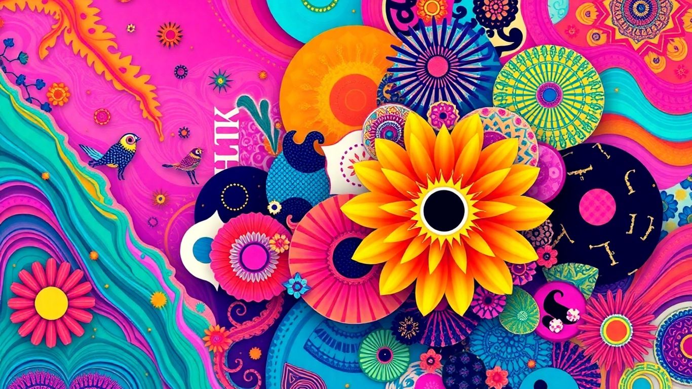
Embracing the Richness of Maximalist Aesthetics
On the flip side, maximalism is about abundance and boldness. Instead of less, it's more. This style embraces vibrant colors, complex patterns, varied typography, and a lot of visual information. It's about making a strong statement and creating a rich, layered experience. Maximalist designs often aim to grab attention immediately and can feel very energetic and expressive. It's like throwing a party for your eyes, with lots of interesting things to look at and discover.
Key characteristics of maximalism include:
- Bold Colors: Bright, contrasting, and often unexpected color combinations.
- Layered Visuals: Use of patterns, textures, and multiple images.
- Dynamic Typography: Experimentation with different font styles and sizes.
- Abundant Content: A willingness to present a lot of information and visual elements.
Defining Your Brand's Visual Identity
So, how do you figure out which path is right for your brand? It really comes down to what your brand is all about. Are you the quiet, sophisticated type, or are you the loud, energetic one? Your brand's personality should be the main driver. Think about the feeling you want people to have when they interact with your brand. Minimalism might suit a brand that wants to convey elegance and quality, while maximalism could be perfect for a brand that's all about creativity, fun, or making a bold statement. It’s about making sure your website’s look matches the story you’re trying to tell.
The Impact of Minimalism on Brand Perception
When you strip away all the extra stuff, what's left? That's kind of the idea behind minimalist web design. It's not just about looking clean; it's about sending a specific message to the people who visit your site. Think about it: when a website is super simple, with lots of empty space and not much going on, it often feels really polished and, well, expensive. It suggests that the brand behind it is confident. They don't need a lot of flashy graphics or loud colors to get your attention because they believe their product or service speaks for itself. This kind of design can make a brand seem really timeless, like it's not chasing every fleeting trend. It's a quiet confidence that can really appeal to people who appreciate quality and don't want to be overwhelmed by a busy screen.
Conveying Sophistication and Timelessness
Minimalist design often uses a limited color palette, usually neutrals or muted tones, and plenty of white space. This deliberate lack of clutter makes everything feel more intentional. It's like a well-organized room versus a messy one – the organized one just feels more put-together and calm. For a brand, this translates into an image of sophistication. It says, 'We've thought about this, we know what's important, and we're not going to waste your time with distractions.' This approach can make a brand feel like it's above the fray, not subject to the whims of fast-changing styles. It creates a sense of lasting quality, suggesting that the brand, much like its website, is built to endure.
Highlighting Product Quality and Confidence
When a website is minimalist, the focus naturally shifts to the actual content – the products, the services, the core message. There are fewer visual elements competing for attention, so whatever is there, like a product image or a key piece of text, really stands out. This can make the product itself seem more important and higher quality. It's like putting a single, perfect diamond on a velvet cushion instead of scattering a bunch of costume jewelry around. The simplicity communicates a strong belief in the inherent value of what's being offered. It shows a brand that's not afraid to let its offerings shine on their own merit.
Appealing to a Discerning Audience
People who are drawn to minimalist design often appreciate subtlety and intentionality. They're not looking for a loud, in-your-face experience. Instead, they might prefer a website that feels calm, organized, and easy to understand. This type of design can attract an audience that is perhaps more educated, has higher disposable income, or simply values a more refined aesthetic. They might see a minimalist website as a sign that the brand understands them and respects their time and intelligence. It's a way of saying, 'We get you,' without having to spell it out with a lot of extra design elements.
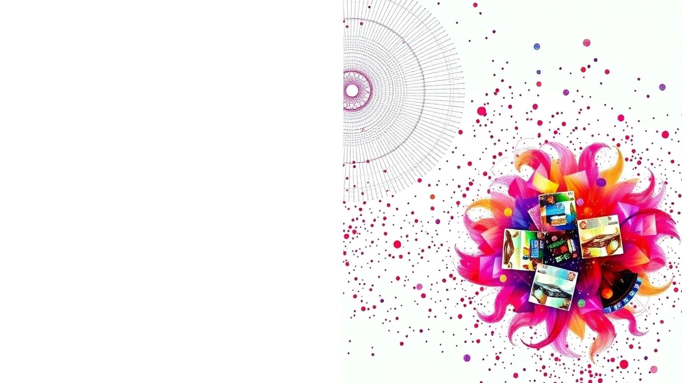
The Power of Maximalism in Capturing Attention
Sometimes, you just need to shout a little louder to get noticed, right? That's where maximalism comes in for web design. It's all about embracing the bold, the vibrant, and the unexpected to really make your brand stand out. Think of it as a visual party where everything is invited – color, pattern, interesting typography, and a whole lot of personality. This approach isn't just about being loud; it's a strategic way to create a memorable impression and build a connection with your audience.
Creating Strong Brand Differentiation
In a crowded online space, it can be tough for a brand to carve out its own identity. Maximalism offers a fantastic way to do just that. By using a rich tapestry of visual elements, you can create a look that's uniquely yours. This isn't about throwing random things at a page; it's about curating a specific aesthetic that tells your brand's story. Whether it's through a vibrant color palette, intricate patterns, or a mix of different artistic styles, maximalism helps you avoid blending in. It's about making a statement that says, 'This is who we are, and we're not afraid to show it.' This distinctiveness can be a huge draw for customers looking for something beyond the ordinary.
Generating Collectible Value and Emotional Bonds
Maximalist design has a unique ability to turn a product or service into something more than just a transaction. When a website feels like a curated experience, filled with interesting details and a strong visual narrative, it can create a sense of collectibility. People might return just to explore the site again, or they might feel a stronger emotional connection to the brand because of its distinctive style. It's like finding a rare piece of art – it sparks joy and a desire to own or be associated with it. This approach can transform a simple purchase into an experience that people want to revisit and share.
Enhancing Experiential Product Value
Maximalism can really amp up the perceived value of what you're offering. When your website is a feast for the eyes, full of rich textures, dynamic visuals, and engaging content, it suggests that the product or service itself is equally rich and engaging. It creates an atmosphere that hints at a deeper, more satisfying experience. For example, a brand selling handcrafted goods might use a maximalist design to showcase the intricate details and artisanal quality of their items. This visual storytelling helps customers imagine the tactile and sensory experience of using the product, making it seem more desirable and worthwhile. It's about creating a whole world around your brand that customers want to be a part of.
Maximalist design is about intentional abundance. It's a deliberate choice to use a wealth of visual information to create a powerful, memorable, and emotionally engaging experience for the user. It’s not just decoration; it’s a language that speaks volumes about the brand's confidence and creativity.
Choosing the Right Design Approach for Your Brand
So, you've got a brand, and now you need to figure out how it should look online. It's not just about picking pretty colors or cool fonts, though that's part of it. The real trick is making sure your website's style actually matches what your brand is all about. Think of it like dressing for an event – you wouldn't wear a tuxedo to a picnic, right? Your website needs to fit the occasion and the vibe you're going for.
Aligning Design with Brand Essence
This is where you really dig into what makes your brand tick. Is it about being super modern and sleek, or more about tradition and a cozy feel? Your brand's core personality should shine through in your web design. If your brand is all about luxury and exclusivity, a cluttered, busy website probably isn't going to cut it. On the flip side, if you're selling handmade crafts with a quirky, fun personality, a super minimalist site might feel a bit cold. The goal is to make sure the design tells the same story as your brand. It's about consistency, so people get a clear picture of who you are from the moment they land on your page. This also extends to how your brand is presented in other areas, like product packaging.
Considering Target Audience Preferences
Who are you trying to reach? Your ideal customer probably has certain expectations when they visit a website. Younger audiences might be drawn to bolder, more dynamic designs, while an older demographic might prefer something cleaner and easier to read. You need to think about what they're used to and what will make them feel comfortable and understood. It's a balancing act, for sure. You want to be true to your brand, but you also don't want to alienate the very people you're trying to attract. Doing a little research here can go a long way.
Strategic Product Positioning Through Design
Your website design can actually help position your products in the market. A minimalist design might suggest high quality and a focus on the product itself, implying that the product is so good it doesn't need a lot of flashy extras. Maximalist design, on the other hand, can create a sense of abundance, excitement, or a rich experience. It can make a product feel more collectible or emotionally engaging. The way you present your products visually online directly influences how people perceive their value and what they expect from them. It's all part of the bigger picture of how your brand communicates its worth.
Key Elements for Effective Minimalist Web Design
When you're aiming for a minimalist look on your website, it's all about being intentional. You're not just taking things away; you're carefully selecting what stays to make the biggest impact. Think of it like decluttering your own home – you keep what's beautiful and useful, and the rest has to go. This approach really helps your brand feel clean and focused.
Strategic Use of Color and White Space
Color is a big deal in minimalist design, but you don't need a rainbow. Often, a limited palette works best. This could be a couple of core brand colors, or even just black, white, and one accent color. The key is to use these colors purposefully. White space, or negative space, is just as important. It's not empty; it's there to give elements room to breathe. This makes the content easier to read and helps guide the visitor's eye. It creates a sense of calm and sophistication.
Focusing on Essential Content and Typography
With minimalism, every word and every font choice counts. You need to strip away anything that doesn't directly serve your message. This means clear, concise copy that gets straight to the point. Typography plays a huge role here. Choosing the right fonts – usually clean, readable ones – can make a big difference. Think about how the text looks on the page. Is it easy to scan? Does it feel organized? Good typography makes the content accessible and pleasant to read.
Leveraging High-Quality Materials and Imagery
Even though you're using less, what you do use needs to be top-notch. This applies to everything from the photos you choose to the icons and graphics. High-quality images that are sharp, well-composed, and relevant to your brand can really make a minimalist site shine. They become focal points. It's better to have one stunning image than a dozen mediocre ones. This attention to detail shows your brand cares about quality and professionalism.
Minimalism isn't about emptiness; it's about intentionality. Every element on the page should have a purpose, contributing to a clear and focused user experience. This deliberate selection process helps your brand communicate confidence and clarity.
Here's a quick rundown of what to keep in mind:
- Color Palette: Stick to a few colors. Think neutrals, a primary brand color, and maybe one accent. Avoid busy, multi-colored schemes.
- Typography: Choose clean, readable fonts. Use font weights and sizes to create hierarchy, not a dozen different font styles.
- Imagery: Invest in professional, high-resolution photos or graphics that align with your brand's message. One great image is better than many average ones.
- Layout: Embrace white space. Let elements breathe. Use grids to keep things aligned and organized.
Crafting a Compelling Maximalist Web Design
So, you're thinking about going full maximalist with your website? Awesome! It’s a bold move, for sure, but when done right, it can really make your brand pop. Forget the idea that more is always messy; maximalism is about controlled chaos, a vibrant explosion of personality that grabs people and doesn't let go. It’s not just about throwing a bunch of stuff onto a page; it’s a deliberate choice to create an immersive, unforgettable experience. Think of it as a curated gallery, not a cluttered attic.
Bold Color Palettes and Dynamic Typography
Maximalism loves color, and it’s not shy about it. We're talking about rich, saturated hues, unexpected combinations, and maybe even some flashy gradients that move. This isn't the place for muted tones; it's about making a statement. Pair these vibrant colors with typography that has some serious character. Think chunky serifs, playful scripts, or even custom lettering that feels like art. The goal is to create visual energy that pulls visitors in. This approach is fantastic for brands that want to convey excitement, creativity, or a sense of playful rebellion. It’s about showing off your brand's unique spirit without holding back. You want people to feel the energy the moment they land on your page.
Incorporating Rich Visuals and Cultural References
Beyond just colors and fonts, maximalism thrives on layers of visual information. This could mean intricate patterns, detailed illustrations, or a collage of images that tell a story. Don't be afraid to weave in cultural references that speak to your brand's identity or your audience's interests. This adds depth and makes your site feel more personal and relatable. It’s like inviting people into a world that’s rich with meaning and detail. This can really help in creating a strong brand differentiation, making your site stand out from the sea of sameness. It’s about building a connection that goes beyond just a transaction.
Balancing Complexity with User Experience
Now, here’s the tricky part: making all this richness work without overwhelming your visitors. The key is balance. While maximalism embraces complexity, it still needs to be user-friendly. This means thoughtful organization, clear calls-to-action, and making sure people can actually find what they're looking for. You don't want your amazing design to become a barrier. Think about how users will move through the site. Are the navigation elements clear, even amidst the visual feast? A well-designed maximalist site feels intentional and exciting, not just busy. It’s about creating an experience that’s engaging and easy to interact with, ensuring visitors don't get lost in the details. You want them to explore, not get frustrated. Making sure your website has clear, well-placed calls-to-action and intuitive navigation is key here.
Minimalism vs. Maximalism: Which Works Best for Your Brand?
So, you've been thinking about your brand's look and feel, and you're stuck between two big design ideas: minimalism and maximalism. It's not just about what looks good; it's about what actually helps your brand succeed. Picking the right one can feel like a huge decision, but it really comes down to a few key things.
Assessing Your Brand's Unique Needs
First off, what's your brand all about? Are you trying to project an image of calm, sophisticated luxury, or are you all about bold energy and making a statement? Minimalism often works wonders for brands that want to convey a sense of timeless quality and confidence. Think of high-end skincare or artisanal coffee – they often use clean lines and lots of white space to make the product itself shine. It’s like saying, “Our product is so good, it doesn’t need a lot of fuss.”
Maximalism, on the other hand, is fantastic for brands that want to grab attention and tell a story. It’s about using color, pattern, and rich visuals to create something memorable and exciting. This approach is great for brands that want to stand out in a crowded market, maybe something like a quirky independent clothing store or a craft brewery with a unique vibe. It can create a strong emotional connection, making your brand feel more like a collectible or an experience rather than just a product. It’s about making people feel something strong right from the start.
The Role of Trends in Design Decisions
Trends come and go, and it's easy to get caught up in what's popular right now. But here's the thing: a design that's too trendy might look dated pretty quickly. Minimalism, with its focus on simplicity and clean aesthetics, tends to age much better. It’s a classic for a reason. Maximalism can also be timeless if done right, but it often relies on current cultural references or artistic styles, which can shift. The goal isn't just to follow a trend, but to choose a style that genuinely fits your brand's long-term vision.
Achieving Brand Success Through Design Alignment
Ultimately, the most successful brands are the ones where the design perfectly matches their core message and who they're trying to reach. If your brand is about simplicity and quality, a minimalist website and packaging will probably do you a lot of good. If your brand is about excitement, creativity, and a bit of an edge, then maximalism might be the way to go. It’s about making sure that when someone encounters your brand, whether it's on a website or a product package, it all feels like it belongs together. This consistency builds trust and makes your brand more recognizable. Think about how customer reviews can also shape perception; a consistent visual identity reinforces that positive feedback.
Here’s a quick way to think about it:
- Minimalism: Focuses on clarity, essential elements, and a sense of calm. Good for conveying sophistication and quality.
- Maximalism: Embraces boldness, detail, and visual richness. Good for creating strong differentiation and emotional connections.
Choosing between minimalism and maximalism isn't about picking the
Deciding between a simple or a more detailed look for your brand's online presence can be tricky. Minimalism focuses on clean, uncluttered designs, while maximalism embraces bold colors and busy patterns. Both can be effective, but the key is choosing what truly represents your business and connects with your audience. Want to explore which style fits your brand best? Visit our website to learn more and see how we can help you create a stunning online experience.
Finding Your Brand's Sweet Spot
So, we've looked at both sides of the coin – the clean, simple vibe of minimalism and the bold, busy world of maximalism. It's pretty clear there's no one-size-fits-all answer here. What works for one brand might be a total miss for another. Think about who you're trying to reach and what you want them to feel when they see your website or your product. Do you want them to feel calm and sophisticated, or excited and intrigued? Your brand's personality is the real guide. Don't be afraid to mix things up a bit, either. Sometimes, a touch of minimalism can make a bold statement even stronger, or a splash of color can liven up a simple design. The main thing is to make sure whatever you choose feels right for your brand and helps you connect with your audience in a meaningful way. It's all about finding that perfect balance that tells your story best.
Frequently Asked Questions
What's the main difference between minimalist and maximalist web design?
Think of minimalist design like a clean, uncluttered room with only the essentials. It focuses on simplicity, lots of white space, and easy-to-read text. Maximalist design is like a vibrant, busy room filled with interesting objects, bold colors, and lots of patterns. It's all about making a big, memorable statement.
Which design style is better for a new brand?
It really depends on what your brand is all about! If you want to seem sophisticated, trustworthy, and focus on high-quality products, minimalism might be a great fit. If your brand is bold, artistic, or wants to grab attention right away, maximalism could be the way to go.
Can minimalism make a brand seem boring?
Not at all! When done right, minimalism can make a brand feel very classy and modern. It's about being intentional with every element, like using just a few key colors and clear fonts. This can actually make your message stronger and more memorable because there's nothing distracting from it.
How does maximalist design help a brand stand out?
Maximalism is all about making a splash! By using bright colors, cool graphics, and unique styles, your website can look totally different from competitors. This helps people remember your brand and can create a strong emotional connection, especially if your design tells a cool story.
What are some key things to remember for minimalist web design?
Keep it simple! Use plenty of empty space (that's white space!), choose only the most important words and clear fonts, and use high-quality images that really pop. Think 'less is more' – every element should have a purpose.
What if I want my brand to feel exciting and full of personality?
Then maximalism might be perfect for you! You can use a lot of different colors, fun fonts, and cool pictures or patterns. The trick is to make sure all these busy elements work together so your website is exciting but still easy for people to use and understand.


Comments
Post a Comment