Stop Losing Visitors: Avoid These Common Web Design Mistakes Instantly
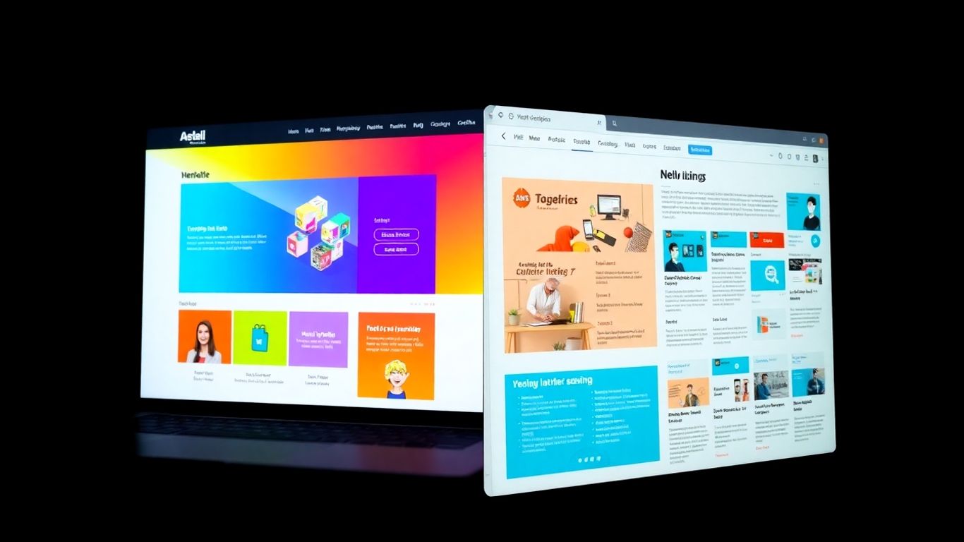
Your website is often the first real look people get at your business. If it's not right, they might just leave and not come back. It's like showing up to a meeting with messy hair and wrinkled clothes – it just doesn't make a good impression. Lots of small web design mistakes can add up, making people lose trust and go elsewhere. We're going to look at some of the biggest Common Web Design Mistakes That Make Visitors Leave Instantly so you can fix them.
Key Takeaways
- Confusing navigation makes people leave because they can't find what they need quickly.
- Slow websites are a major turn-off; optimize images and code to keep visitors engaged.
- A bad mobile experience will lose you over half your visitors, as most people browse on phones.
- Without clear calls-to-action, visitors won't know what to do next, leading to missed opportunities.
- Outdated or inconsistent design hurts your brand's credibility and makes people doubt your business.
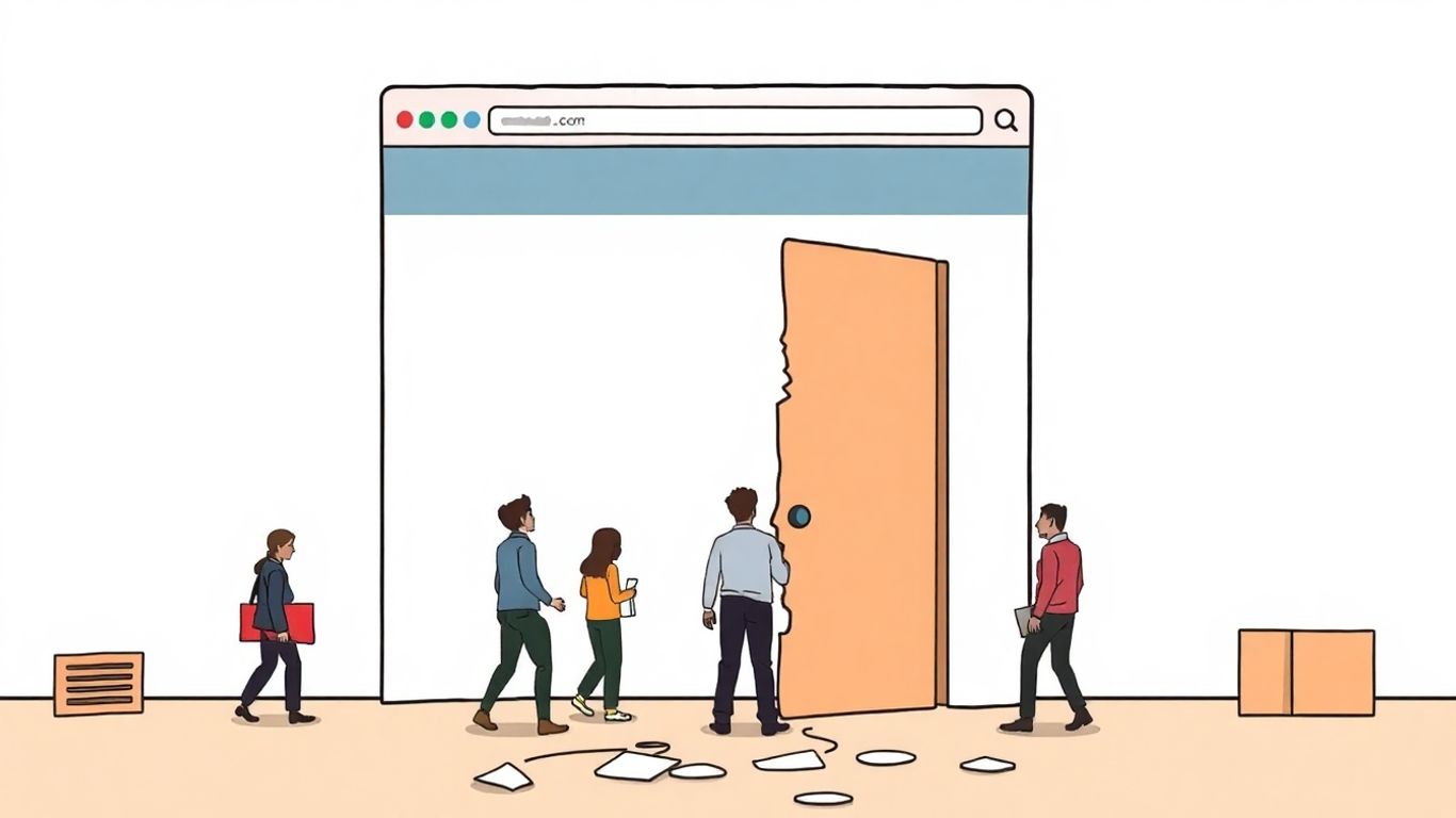
Confusing Navigation That Drives Visitors Away
When someone lands on your website, they're usually looking for something specific. They don't want to play a guessing game to find it. If your site's navigation is a maze, people will just leave. It's that simple. A cluttered or illogical menu is one of the fastest ways to lose potential customers.
Overloaded Menu Structures
Think about your main menu. Is it packed with every single page and sub-page you have? That's a common mistake. Users scan, they don't read every word. Too many options create decision paralysis. Try to keep your top-level menu focused on the main areas of your site. Group related content together logically. For example, instead of having separate links for 'About Us,' 'Our Team,' and 'Company History,' consider a single 'About' section with those as sub-items. This makes the main menu cleaner and easier to process.
Lack of Clear Hierarchy
Even if your menu isn't overloaded, it might still be confusing if there's no clear order. Important pages shouldn't be buried three clicks deep. Users expect to find key information easily. A good rule of thumb is to make your most important pages, like contact information or a 'get a quote' page, impossible to miss. A well-structured site helps users understand where they are and where they can go next. This clarity is key to a good user experience.
Hidden Navigation Elements
Sometimes designers try to be clever with navigation, hiding it behind icons or using animations that roll and bounce. While this might look modern to some, it often just confuses visitors. If a user can't immediately see how to get around, they'll likely get frustrated. Standard navigation patterns are familiar to most users. Sticking to these conventions makes your site feel intuitive. For instance, a hamburger menu (the three horizontal lines) is common on mobile, but on a desktop, it's usually better to have your main menu visible. Making sure your navigation is easy to find and use is a big part of professional web design.
Users don't have a lot of patience. If they can't figure out how to get where they want to go on your site within a few seconds, they're going to hit the back button and try someone else's website. Keep it simple and obvious.
Slow Loading Speeds That Kill Engagement
Nobody likes waiting around, and that's especially true when browsing the web. If your website takes too long to load, people will just leave. It’s that simple. Studies show that even a one-second delay can really hurt your conversion rates, sometimes by over 4%. That's a big chunk of potential business gone because your pages are sluggish.
Unoptimized Image Files
Big, high-resolution images look great, but they can really slow down your site. It’s a common problem. People often use images straight from a camera or design software without thinking about file size. You can fix this by compressing your images. Tools like Adobe Photoshop can help, or if you're using a platform like WordPress, there are plugins that do the work for you. The goal is to make the file size smaller without making the picture look bad. It’s a balance, but it’s worth getting right.
Inefficient Code Practices
Sometimes, the problem isn't just images. The actual code that makes your website work can also be a culprit. Things like too many scripts running at once, or poorly written code, can bog down your server. This is where things get a bit technical, but it’s important. Making sure your code is clean and efficient helps your site load faster. Think of it like decluttering a room; the less junk there is, the easier it is to move around.
Subpar Hosting Solutions
Your web hosting is like the foundation of your website. If the foundation is weak, the whole structure suffers. Shared hosting plans, while cheaper, can sometimes mean your site is sharing resources with many other sites, leading to slower speeds. Upgrading to a dedicated server or a cloud-based solution can make a big difference. It gives your website more power and stability, which directly translates to faster loading times. Choosing the right hosting provider is a big step in keeping your site speedy.
A website that loads quickly not only keeps visitors happy but also tells search engines like Google that your site is reliable and user-friendly. This can positively impact your search rankings.
Here are a few things to check:
- Image Compression: Are your images optimized for the web?
- Code Efficiency: Is your website's code clean and streamlined?
- Hosting Quality: Is your hosting plan robust enough for your traffic?
- Server Response Time: Aim for response times under 200 milliseconds.
Poor Mobile Experience Frustrating On-the-Go Users
It’s 2025, and if your website isn't playing nice with phones, you're basically telling half your potential customers to go somewhere else. Seriously, most people check out websites on their phones these days. If it’s a pain to use – like tiny buttons you can’t hit or text that’s too small to read – they’re not sticking around. It’s like trying to read a book through a keyhole; nobody has the patience for that.
Tiny, Untappable Buttons
Remember trying to tap a tiny button on a website and accidentally hitting the link next to it? Yeah, that's a big no-no. Mobile users need buttons that are big enough to tap easily with a finger, not a precision instrument. Think about it: if your main 'Buy Now' button is the size of a pea, you're not going to sell much. Make your buttons large and give them plenty of space around them. This simple change can make a huge difference in how many people actually complete a purchase or sign up for something.
Non-Scalable Layouts
Your website should look good and work well no matter what size screen it's on. If your desktop site just shrinks down to fit a phone, but everything is still too small or gets cut off, that’s a problem. A good mobile site adjusts its layout so that content flows naturally and is easy to read. This means things like text size, image spacing, and menu options all adapt. Trying to pinch and zoom constantly is a quick way to lose visitors. A responsive design is key to keeping users happy and engaged on their phones, which is why many businesses invest in professional web development to get this right.
Awkward Content Columns
Sometimes, designers cram too much information into narrow columns on mobile, making it look like a jumbled mess. This isn't just ugly; it makes it hard to follow along. Imagine reading a book where the words are all squished together with no breaks. It’s exhausting. Breaking up text with shorter paragraphs, using bullet points, and ensuring there's enough white space makes content much more digestible. This is especially important for longer articles or product descriptions. A well-structured mobile layout helps users find the information they need quickly without feeling overwhelmed. It's about making the reading experience pleasant, not a chore. You can check how your site looks on different devices using tools that help with responsive design testing.
When a website feels clunky or difficult to use on a phone, people don't usually blame their phone; they blame the website. And then they leave. It's that simple.
Here’s a quick look at what to avoid:
- Buttons too small: Users miss-tap and get frustrated.
- Text unreadable: Requires zooming and scrolling, which is annoying.
- Images not resizing: They might be cut off or too large to see properly.
- Menus hard to find: Users can't get to where they want to go.
Getting the mobile experience right is a big part of making sure people stick around and actually do what you want them to do on your site. It’s not just about looking good; it’s about being functional and user-friendly for the majority of your visitors.
Weak Or Missing Calls-to-Action

So, you've got people visiting your site. That's great, right? But if they're just browsing and then leaving without doing anything, you're missing out. This is often because the website doesn't clearly tell them what to do next. Think of it like a store with no checkout counter – people might look around, but they can't actually buy anything.
Pages Lacking Direction
When a visitor lands on a page, they should have a pretty good idea of what you want them to do. If a page just ends with a bunch of text or a generic statement, people get confused. They don't want to guess what the next step is. You need to guide them. This means making sure every important page has a clear purpose and a way for the visitor to achieve that purpose.
- Define the primary goal for each page. What's the one thing you want visitors to do there?
- Place your call-to-action (CTA) where it makes sense. Don't hide it at the very bottom if the page's main point is to get someone to sign up.
- Use whitespace effectively. Give your CTAs room to breathe so they stand out.
Generic Button Text
It's not just about having a button; it's about what that button says. Buttons that just say "Submit" or "Click Here" are really unhelpful. They don't tell the user what they're actually submitting or clicking on. You want your button text to be specific and action-oriented. Instead of "Learn More," try something like "Get Your Free Quote" or "Download the Guide." This makes it much clearer what the user will get by clicking.
Here's a quick comparison:
| Generic Text | Better Alternative |
|---|---|
| Submit | Sign Up Now |
| Click Here | View Our Services |
| Go | Start Your Trial |
Misplaced Action Prompts
Even if you have a great CTA button with clear text, it won't work if people can't find it. Sometimes, designers put CTAs in odd places. They might be too small, blend in with the background, or be buried under other content. Remember, people often skim web pages. Your main call-to-action needs to be visible and easy to spot. Making sure your CTAs stand out, especially on mobile devices, is key to getting more people to take that desired action. A well-placed CTA can really make a difference in website conversion rates.
A website without clear calls-to-action is like a conversation with no conclusion. Visitors need to know what you want them to do next, and it needs to be obvious.
Outdated Design Undermining Brand Credibility
Your website is often the very first interaction a potential customer has with your brand. If it looks like it’s stuck in the past, that first impression can seriously damage your credibility. Think about it: would you trust a business with a website that feels like it’s from 2005? Probably not. An outdated design doesn't just look bad; it signals that your business might not be current or innovative.
Reliance on Old Technologies
Using technologies like Flash, which is now obsolete, or relying on outdated coding practices can make your site slow, insecure, and incompatible with modern browsers and devices. This not only frustrates users but also makes your site harder to find on search engines. It’s like trying to run a marathon in lead shoes. If your site isn't built with current standards, it's already at a disadvantage. Consider updating your site's foundation to ensure it's robust and future-proof.
Default Font Choices
While it might seem like a small detail, font choices have a big impact. Using default fonts like Times New Roman or Arial across your entire site can make it look generic and uninspired. Your typography is a key part of your brand's voice. Instead, opt for fonts that align with your brand's personality and are easy to read on all screen sizes. A well-chosen font can make your content more engaging and your brand more memorable. Think about pairing a distinctive heading font with a clean, readable body font for a professional look.
Cluttered Layouts
Websites from earlier eras often suffered from cluttered layouts, with too much information crammed onto a single page. This makes it difficult for visitors to find what they're looking for and can be overwhelming. Modern design principles emphasize white space, clear visual hierarchy, and organized content.
A clean, well-organized layout guides the user's eye and makes the entire experience more pleasant. It shows you respect your visitor's time and attention.
When your layout is messy, it suggests a lack of organization within your business itself. Aim for simplicity and clarity in your design. This includes using headings, subheadings, bullet points, and images to break up text and create visual interest. A good user experience is paramount, and a cluttered design actively works against it. If your site feels like a digital jumble, it’s time for a redesign to improve user experience.
Neglecting Search Engine Optimization Basics
It’s easy to get caught up in how your website looks and feels, but if search engines can’t find it, what’s the point? Ignoring the fundamentals of SEO is like building a beautiful store on a street nobody knows about. Search engines like Google are how most people discover new websites, so if your site isn’t set up right, you’re missing out on a huge chunk of potential visitors.
Missing Page Titles
Every page on your website needs a clear, descriptive title. This is what shows up in the browser tab and, more importantly, in the search results. If you don’t have a title, or if it’s generic like “Home Page,” search engines won’t know what the page is about, and neither will potential visitors scanning the search results. Think of it as the headline for your page – it needs to grab attention and tell people exactly what they’ll find.
Broken Internal Links
Internal links are the connections between different pages on your own website. When these links are broken (meaning they lead to a page that doesn’t exist or is no longer there), it’s a big problem. Search engines see this as a sign of a poorly maintained site, which can hurt your ranking. Plus, it’s super frustrating for users who click a link expecting to find something and instead get an error message. Regularly checking for and fixing broken links is a must.
Unstructured Content
Search engines also look at how your content is organized. If you have long, unbroken blocks of text, it’s hard for both users and search engine bots to understand what’s important. Using headings, subheadings, bullet points, and short paragraphs makes your content much more readable. This not only helps search engines index your pages correctly but also keeps visitors on your site longer because they can easily find the information they need. Good structure signals quality to search engines.
Here’s a quick checklist for SEO basics:
- Page Titles: Unique and descriptive for every page.
- Meta Descriptions: Compelling summaries that encourage clicks.
- Header Tags (H1, H2, H3): Properly used to structure content.
- Image Alt Text: Descriptive text for images, helping search engines understand them.
- Internal Linking: Connecting related pages within your site.
- Mobile-Friendliness: Ensuring your site works well on all devices.
Ignoring SEO basics means your website might be invisible to the very people you want to reach. It’s not just about looking good; it’s about being found.
Content Presentation That Overwhelms Readers
Look, nobody wants to land on a page that feels like a giant, unbroken block of text. It’s like being handed a novel when you just wanted a quick answer. People today skim. They scan. They don't sit down and read every single word like they used to. If your content looks like a dense wall, visitors are going to bounce. It’s that simple. This is a common mistake that really hurts user experience and makes all your hard work harder to digest.
Walls of Unbroken Text
This is probably the most obvious offender. You know, those pages where the paragraphs are so long, you can barely see the end of them? It’s intimidating. It makes the information seem inaccessible, even if it’s actually really good stuff. Good content presentation breaks up the text so it’s easy to scan and read. Think about it: when you’re looking for something specific online, do you read every word? Probably not. You look for headings, bullet points, and bolded text to guide you. If that’s missing, you’re out.
Absence of Visual Breaks
Beyond just paragraphs, a lack of visual breaks is also a killer. This means no images, no graphics, no charts, nothing to give the reader’s eyes a rest. It’s not just about making things look pretty; visuals help explain complex ideas, add interest, and guide the reader through the content. Without them, even a well-written piece can feel dry and overwhelming. It’s like trying to eat a meal with no texture – just bland mush.
Illegible Font Choices
And then there are the fonts. Choosing the wrong font, or using a font in a way that’s hard to read, is a surefire way to lose people. This isn't just about picking something that looks cool; it's about readability. Tiny fonts, overly decorative fonts, or fonts with poor contrast against the background all make your content a chore to get through. You want people to focus on your message, not struggle to decipher it. Making sure your text is clear and easy to read across all devices is a big part of creating a good user experience.
People often think that more text means more information, but it’s the opposite. Well-organized, visually broken-up text is far more effective at communicating your message and keeping readers engaged. It’s about clarity, not quantity.
Here’s a quick rundown of what to avoid:
- Paragraphs longer than 4-5 sentences. Break them up!
- No headings or subheadings. Use them to guide the reader.
- Lack of images, icons, or other graphics. These provide visual relief and aid understanding.
- Using the same font size and style throughout. Varying size and weight can highlight important information.
- Poor color contrast between text and background.
Remember, the goal is to make your content as easy and pleasant to consume as possible. If your website feels cluttered or hard to read, it’s a sign that your content presentation needs a serious rethink. This is a key part of avoiding common web design mistakes.
Inconsistent Branding Eroding Trust
Think about it: you land on a website, and it just feels… off. Maybe the logo looks a little different than you remember, or the colors seem to clash with what you saw on their social media. This kind of visual confusion isn't just annoying; it actively chips away at your visitors' trust. When your brand's look and feel aren't consistent across your website, it sends a message that you might be disorganized or even unprofessional. People want to feel confident they're dealing with a solid, reliable business, and visual harmony is a big part of that. It’s like meeting someone who changes their personality every five minutes – you wouldn’t know what to expect, and you probably wouldn’t stick around for long.
Mismatched Color Palettes
Colors are powerful. They evoke emotions and create associations. If your website bounces between a calm blue on one page and a jarring neon green on another, without any clear reason, it’s jarring. This isn't just about aesthetics; it's about building a recognizable identity. A consistent color scheme helps visitors instantly connect what they're seeing with your brand. It makes your site feel put-together and intentional. Imagine a bakery that uses a different sign color every day – you’d start to wonder if it was even the same place.
Conflicting Font Usage
Fonts are another area where consistency really matters. Using a clean, readable font for your main text is important, but so is sticking to a limited set of fonts throughout your site. If you’re jumping from a fancy script font for headings to a blocky sans-serif for body text, and then a typewriter font for a quote, it looks messy. This visual clutter makes it harder for people to read your content and can make your brand seem less serious. It’s best to stick to two or three fonts at most – one for headings, one for body text, and maybe an accent font if needed. This creates a professional and easy-to-read experience.
Disjointed Messaging
Beyond just colors and fonts, your brand's voice and the core messages you communicate need to align. If your website copy talks about being a friendly, approachable service, but the tone is overly formal or uses jargon, there's a disconnect. This inconsistency can happen when different people work on different parts of the website without a clear brand guide. It’s important that the language used, the offers presented, and the overall tone of voice all work together to present a unified brand image. This helps build stronger brand recognition and makes visitors feel more secure in their interactions with your business.
When your website’s visual elements and messaging don’t align, it creates a sense of unease. Visitors might question the legitimacy of your business or simply feel confused about what you offer. A unified brand presentation builds confidence and makes your site a more pleasant place to be.
When your brand's message isn't clear, people start to doubt you. If your company's look and feel keeps changing, it can make customers feel unsure. This can hurt your business. Make sure your brand is consistent and builds trust. Visit our website to learn how we can help you create a strong, reliable brand image.
Keep Your Website Working For You
So, we've gone over a bunch of ways your website might be turning people away without you even knowing it. Things like confusing menus, slow loading times, or a site that just doesn't work right on a phone can really hurt your business. It’s easy to get caught up in how a site looks, but remember, people need to be able to use it easily. Fixing these common issues isn't just about making your site pretty; it's about making sure visitors stick around, understand what you offer, and actually do what you want them to do. Think of your website as your hardest working employee – give it the right tools and a clear path, and it’ll help you grow.
Frequently Asked Questions
Why is website navigation so important?
Good navigation is like a clear map for your website. If visitors can't easily find what they're looking for, they'll get frustrated and leave. Think of it as making sure all the doors and signs on your site point people in the right direction.
How does website speed affect visitors?
People today want things fast. If your website takes too long to load, even just a few extra seconds, visitors will likely click away. Slow sites can make people think your business isn't up-to-date or reliable.
Why should I care about how my website looks on a phone?
A lot of people browse the internet on their phones. If your website isn't easy to use on a small screen – like if buttons are too tiny to tap or text is too small to read – you're missing out on a huge number of potential visitors.
What's a 'call-to-action' and why do I need one?
A call-to-action, or CTA, is like telling your visitors what to do next, such as 'Sign Up Now' or 'Buy Here.' Without clear CTAs, visitors might not know how to take the next step, and you could lose a sale or a lead.
How can an outdated website hurt my business?
If your website looks like it's from the past, it can make your business seem old-fashioned too. This can make people doubt your credibility and choose a competitor with a more modern, trustworthy-looking site.
What does 'SEO basics' mean for web design?
SEO basics are things you do in your website's design to help search engines like Google find and rank your site. This includes using clear page titles, making sure links work, and organizing your content so search engines understand it.


Comments
Post a Comment