Minimalism 2.0: Unveiling How Less Design Achieves Greater Results
We're talking about Minimalism 2.0, a design approach that's more than just pretty pictures and empty space. It's about making things work better by using less. Think about it: in a world that's constantly throwing information at us, sometimes the best way to get noticed is to be calm and clear. This isn't about being boring; it's about being smart. We're looking at how this 'less is more' idea, when done right, can actually make websites and brands more effective. It’s a way to cut through the noise and really connect with people.
Key Takeaways
- Minimalism 2.0, or intentional design, focuses on using only necessary elements to achieve better results, moving beyond just looks to prioritize function and purpose.
- This design style communicates a sense of modernity and quality, helping brands appear sophisticated and relevant over time, rather than chasing fast-changing trends.
- Effective minimalist web design relies on smart use of white space, simple typography and color choices, and easy-to-use navigation.
- Designers must carefully balance simplicity with what users expect, focusing on core content and finding creative ways to work within design limits.
- Real-world examples show that minimalist approaches work well for e-commerce, blogs, and portfolios, helping them stand out and connect with users.
Understanding Minimalism 2.0: Why Less Design Delivers More Results
So, what's this "Minimalism 2.0" all about? It's not just about making things look clean and simple, though that's definitely part of it. Think of it as a smarter, more intentional way to design. We're talking about cutting out the noise, the stuff that doesn't really help anyone, and focusing on what truly matters. It's a reaction to how overwhelming the internet has become. Remember when websites tried to shove everything onto one page? Yeah, that was a lot. Minimalism 2.0 flips that idea on its head.
The Core Philosophy of Intentional Design
At its heart, this approach is about making deliberate choices. Every single element on a page, every button, every word, should have a reason for being there. It's like decluttering your house, but for your website. You keep what's useful and beautiful, and you get rid of the rest. This means we're not just removing things for the sake of it; we're carefully selecting what stays to make the experience better for the person using it. It’s about purpose, not just looks. This careful curation often translates to users perceiving higher quality in the product or service itself. If a company puts this much thought into their website, they probably put similar care into what they actually offer.
Beyond Aesthetics: Functionality and Purpose
While minimalist designs often look great, the real magic happens with how they work. When you strip away the extra stuff, the important things naturally stand out. This makes it easier for people to find what they're looking for and do what they came to do. It’s about making things work better by making them simpler. Think about it: fewer options usually mean less confusion. This focus on function means that even with limited design elements, the user experience can be incredibly smooth. It’s a way to communicate clearly and directly, without getting bogged down in decoration. This approach is particularly effective for tech companies, aligning with perceptions of innovation and user-centered design, much like the interfaces we see on smartphones.
A Reaction to Information Overload
Let's be honest, the internet is a noisy place. We're bombarded with information constantly. Minimalism 2.0 is a breath of fresh air in that environment. It’s a way to cut through the clutter and give people a more focused, less stressful experience. Instead of overwhelming users with too much at once, it guides them gently. This approach acknowledges that people have limited attention spans and often prefer a straightforward path. It’s about respecting the user’s time and mental energy. The result is a design that feels calm and controlled, which is a welcome change for many.
- Reduced cognitive load: Users don't have to process as much information.
- Improved focus: Attention is directed to key content and actions.
- Faster loading times: Fewer elements mean quicker page performance.
- Enhanced usability: Simpler interfaces are generally easier to understand and use.
The Strategic Advantages of Minimalist Design

Communicating Modernity and Forward-Thinking
Minimalist design isn't just a look; it's a statement. In a world that's constantly buzzing with new ideas and tech, a clean, uncluttered website tells people you're up-to-date and thinking ahead. Think about it: elaborate, busy designs can start to feel old-fashioned pretty quickly as trends change. But a simple, well-executed minimalist site? It tends to stick around, looking relevant for years, not just months. This means your design investment keeps paying off, and your brand looks like it's part of the future, not the past. This is especially true for tech companies, where simplicity often mirrors the user-friendly nature of their products. It just feels innovative.
Enhancing Brand Perception: Sophistication and Quality
When a website is stripped down to its essentials, every single element has to earn its place. This deliberate approach, where each choice is intentional and serves a purpose, communicates a high level of care and attention to detail. Users notice this. They tend to think, "If their website is this well-thought-out, they probably put that same level of care into their actual products or services." It’s a subtle but powerful way to build trust and suggest quality. Conversely, a messy, chaotic website can make a brand seem careless, and that perception can easily spill over to what they offer. Minimalism positions your brand as sophisticated and quality-focused.
Achieving Timeless Relevance Over Fleeting Trends
Design trends come and go, sometimes faster than we can keep up. What looks cutting-edge today might seem a bit much next year. Minimalist design, however, has a way of sidestepping this. By focusing on core principles like clear layouts, good typography, and purposeful use of space, it creates a look that’s less about being trendy and more about being effective. This longevity means you don't have to constantly redesign your site just to keep up with the latest fads. It’s a more sustainable approach that keeps your brand looking fresh and relevant without chasing every new style. It’s about building a solid foundation that lasts, which is great for long-term brand authority.
Here's a quick look at what makes minimalist design stand out:
- Focus on Content: Every word and image is there for a reason.
- Strategic Whitespace: Gives elements room to breathe and guides the eye.
- Purposeful Typography: Fonts are chosen for readability and aesthetic impact.
- Limited Color Palettes: Creates a cohesive and sophisticated feel.
The discipline required for successful minimalist design demonstrates attention to quality. Every element is thoughtfully considered, and every choice serves user goals rather than designer ego. This careful curation translates in users' minds to similar attention to quality in products and services.
Key Elements of Effective Minimalist Web Design
So, you're thinking about going minimalist with your website? It's not just about making things look pretty, though that's part of it. It's about being really smart with what you put on the screen. Think of it like decluttering your house – you keep what's useful and what you love, and the rest has to go. The same idea applies here.
Strategic Use of White Space
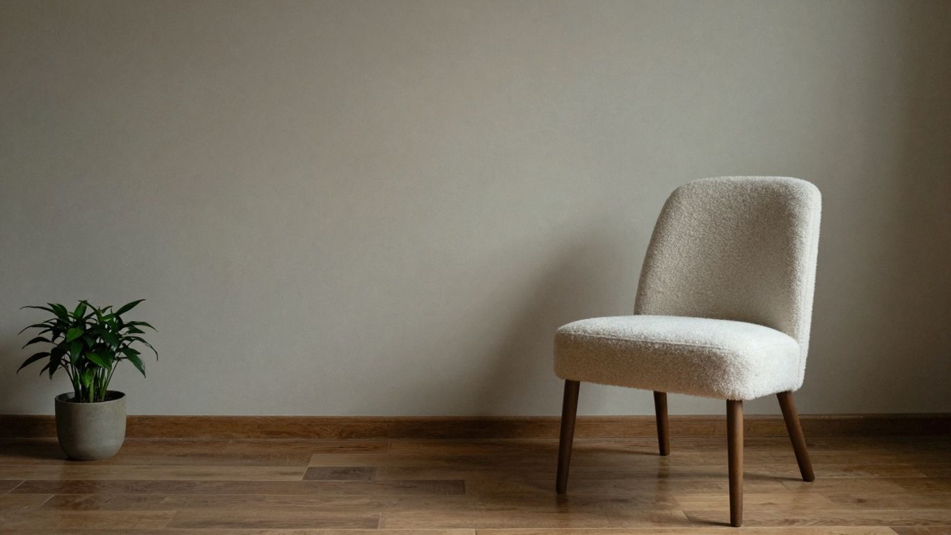
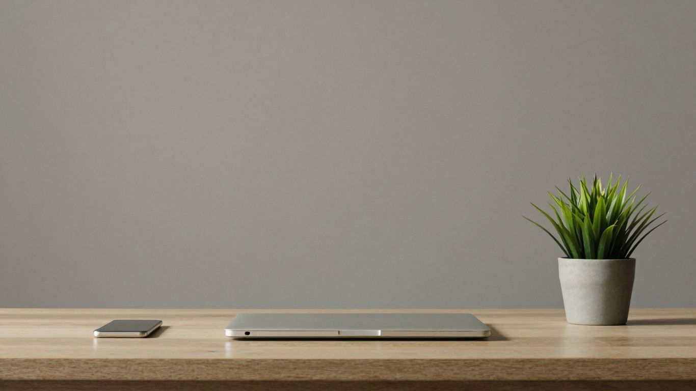
This is probably the most obvious thing you'll notice. White space, or negative space, isn't just empty bits on the page. It's an active design element that helps guide the eye. When you use it well, it makes everything else stand out more. It gives your content room to breathe, making it easier to read and digest. Too little white space, and your site feels cramped and busy. Too much, and it can feel a bit… well, empty. Finding that sweet spot is key.
Here's why it matters:
- Improves Readability: Text is easier on the eyes when it's not crammed together.
- Highlights Important Stuff: Key messages or calls to action get noticed.
- Creates a Clean Vibe: It just looks more professional and less overwhelming.
Purposeful Typography and Color Palettes
Forget using a dozen different fonts and colors. Minimalism is about being deliberate. You pick a few fonts that work well together – maybe a clean sans-serif for headings and another for body text. The goal is clarity and readability. The same goes for color. Often, you'll see a limited palette, maybe black, white, and one accent color. This keeps things looking cohesive and sophisticated.
- Font Choices: Stick to 1-2 font families. Make sure they're easy to read on any screen size.
- Color Strategy: Use color to draw attention to specific elements, not just for decoration.
- Hierarchy: Use font size and weight to show what's most important.
The trick here is that every choice, from the font you pick to the shade of blue you use, needs to have a reason behind it. It's not just about looking good; it's about making the site work better.
Streamlined Navigation and Intuitive Interfaces
If people can't find what they're looking for, even the prettiest minimalist site is a failure. Navigation needs to be super simple. Think clear labels, not too many options, and a consistent layout across the whole site. Sometimes this means using things like a simple hamburger menu on mobile, but on desktop, it might be a very clean, visible menu. The interface should feel natural, like users already know how to use it without thinking too hard. It's all about reducing friction and making the user's journey as smooth as possible.
Balancing Simplicity with User Expectations
It sounds easy, right? Just strip everything away until only the absolute necessities remain. But here's the thing: what's 'necessary' can be a moving target, especially when you're dealing with people who have their own ideas about how things should work. Minimalism 2.0 isn't about ignoring what users want; it's about being smart about how we give it to them.
Prioritizing Essential Content
This is where the real work happens. You can't just guess what's important. You have to know. This means digging into what your users actually need to do on your site. Are they trying to buy something? Find information? Get in touch? Every single piece of content needs to earn its spot. If it doesn't directly help the user achieve their goal, it's probably clutter.
- User Research: Talk to people. Watch them use your current site. What are they looking for? Where do they get stuck?
- Content Audit: Go through everything you have. Does it serve a purpose? Is it up-to-date? Can it be simplified?
- Hierarchy: Decide what's most important and make it obvious. Use size, placement, and color to guide the eye. Everything else should be secondary or even hidden until needed.
Navigating Design Limitations Creatively
Sometimes, the rules of minimalism can feel a bit restrictive. You've got a limited color palette, not a lot of fancy graphics, and navigation has to be super straightforward. This is where you have to get clever. Instead of seeing these as roadblocks, think of them as prompts for innovation. How can you make a simple button feel engaging? How can you use white space to create a sense of luxury? It’s about making every single element count.
The challenge isn't just about removing things; it's about making sure what's left is incredibly effective and easy to understand. It forces a deeper consideration of each design choice.
Educating Users on New Interaction Models
People get used to how things work. If your minimalist design introduces a new way of doing something – maybe a different kind of menu or a less obvious button – users might get confused at first. The key here is gentle guidance. Use clear labels, subtle visual cues, and maybe even a quick, unobtrusive tooltip the first time someone encounters something new. The goal is to make the learning curve as small as possible. It’s a delicate dance between introducing fresh, efficient ways of interacting and respecting the user's existing mental models.
Here's a quick look at how different elements can be simplified:
| Element | Traditional Approach | Minimalist 2.0 Approach |
|---|---|---|
| Navigation | Multiple complex menus, sidebars, many links | Single, clear menu; progressive disclosure; breadcrumbs |
| Forms | Many fields, complex instructions, lots of options | Few fields, clear labels, default options, inline help |
| Visuals | Busy backgrounds, many images, decorative elements | High-quality hero images, clean icons, ample white space |
| Typography | Multiple fonts, sizes, weights, and styles | Limited font families, clear hierarchy, readable sizes |
Real-World Success Stories of Minimalism 2.0
You see minimalism in action everywhere these days, and it's not just about looking pretty. It's about making things work better. Think about how Apple does its online store. They use tons of white space, and the product photos are huge and really clear. You don't get bombarded with a million options; it's just the product, looking good. The navigation is super simple, too. It makes you focus on what you're actually there to see and maybe buy. It’s a smart way to showcase products without overwhelming you.
Then there are sites like Everlane, the clothing company. They stick to a simple color scheme, mostly black and white, and their product grid is really clean. Big, sharp photos of the clothes are the main thing. They don't use a lot of text, just enough to tell you what you need to know. It feels sophisticated, right? It makes you think they care about quality, and that feeling carries over to their clothes.
E-commerce Platforms Showcasing Products
- Apple's Online Store: Focuses on high-quality product imagery and minimal text, creating a clean and intuitive shopping experience.
- Everlane: Utilizes a monochromatic palette and grid layouts, putting product photography at the forefront.
- Warby Parker: Offers a virtual try-on feature within a minimalist interface, simplifying the eyewear selection process.
The discipline required for successful minimalist design demonstrates attention to quality—every element is thoughtfully considered, every detail intentionally designed, and every choice serves user goals rather than designer ego. This careful curation translates in users' minds to similar attention to quality in products and services.
Blogs and Editorial Sites Prioritizing Content
Medium is a great example here. Their whole site is built around making reading easy. Lots of white space around the text, limited colors, and you can see how long an article might take to read. It’s all about the content, not flashy distractions. Even The New York Times, which has a lot of different stories, uses a clean grid and good typography to make their website readable. They integrate interactive stuff and data visualizations, but it doesn't feel cluttered. It just adds to the story.
Portfolio Websites Demonstrating Creativity
Look at Jessica Hische's portfolio. She's a designer, and her site is super clean. A big image when you land on it, a short intro, and then simple thumbnails for her projects. When you click on a project, it stays clean but shows off her work really well. It proves that you don't need a lot of noise to show off your skills and creativity. It's all about making the work the star.
The Discipline Behind Minimalist Design
Making a minimalist website look good and work well isn't just about deleting stuff. It takes a lot of thought and careful planning. You can't just strip everything away and hope for the best. There's a real craft to it, a kind of focused effort that makes sure every single piece you do keep actually matters.
Refining Layouts Through Iteration
Think of it like sculpting. You start with a block of marble, and you chip away until the statue emerges. In design, it's similar. You might start with a more complex idea, but then you keep tweaking, adjusting, and simplifying. It’s not a one-and-done thing. You go back and forth, trying different arrangements, seeing how things feel, and making small changes until it just clicks. This process often involves:
- Trying out different placements for key elements.
- Adjusting spacing to create better flow.
- Simplifying visual cues until they are perfectly clear.
This constant refinement is what separates a truly effective minimalist design from one that just looks unfinished.
The Role of User Testing and Feedback
Even the best designer can get tunnel vision. That's where other people come in. Showing your work to actual users, people who aren't steeped in the design process, is super important. They’ll tell you if something is confusing, if they can’t find what they’re looking for, or if a certain part just feels off. This feedback loop is gold. It helps you see your design through fresh eyes and make changes that genuinely improve the experience for everyone.
Maintaining Design Integrity and Consistency
Once you've got a design that works, the job isn't over. You have to stick with it. Consistency is key in minimalism. If your colors, fonts, and spacing are all over the place, it defeats the whole purpose. It’s about building a clear, predictable experience. This means:
- Having a style guide, even a simple one, to refer to.
- Making sure every new page or feature fits the established look and feel.
- Resisting the urge to add trendy elements that don't serve a purpose.
Sticking to the plan, even when it's tempting to add 'just one more thing,' is where the real strength of minimalist design lies. It builds trust and makes your site feel solid and reliable. It’s about being deliberate with every choice, not just for looks, but for how it helps people use your site.
It’s this kind of careful, ongoing work that makes minimalism 2.0 so powerful. It’s not about being lazy with design; it’s about being incredibly intentional.
Minimalist design isn't just about making things look clean; it's about careful planning and smart choices. It takes real thought to strip away the extra stuff and focus on what truly matters. This kind of design makes things easy to understand and use. Want to see how we bring this thoughtful approach to life for businesses like yours? Visit our website to explore our services and see how we can make your online presence shine with clarity and purpose.
So, What's the Takeaway?
Look, it's pretty clear that when it comes to websites, less really can be more. We've seen how stripping away the noise and focusing on what actually matters makes things easier for people using the site. It’s not just about looking clean, though that’s a big part of it. It’s about making sure people can find what they need without getting lost in a bunch of stuff they don’t care about. When a site feels simple and well-thought-out, it makes you trust the company behind it more. It shows they pay attention to details, and that usually means their actual products or services are pretty good too. So, if you're thinking about your own website, maybe try cutting back a bit. You might be surprised at how much better things work when you just keep it simple.
Frequently Asked Questions
What exactly is 'Minimalism 2.0' in web design?
Think of Minimalism 2.0 as a smarter, more focused way of designing websites. It's not just about making things look empty; it's about carefully choosing only the most important stuff to show. This means getting rid of anything that doesn't help you or the user, making the website easier to use and understand.
Why do companies use minimalist design for their websites?
Companies use this style because it makes them look modern and ahead of the game. It also makes their brand seem more high-quality and trustworthy. Instead of looking trendy for a short time, minimalist sites tend to stay looking good for a long time, which is better for business.
What are the main parts of a minimalist website?
Key parts include lots of empty space, which helps your eyes rest and focus. Simple, easy-to-read text and a limited number of colors are also important. Lastly, the way you move around the site should be super simple and obvious so you don't get lost.
Is it hard to make a minimalist website that people will like?
It can be tricky! You have to figure out what information is truly necessary and what can be left out. Sometimes, you need to be creative to make the site look good and work well without adding too many extra features. You also have to make sure people can still use it the way they expect.
Can you give examples of websites that use this style well?
Sure! Big companies like Apple use it to show off their products with lots of clean space. Websites like Medium make reading articles super easy with simple layouts. Even creative people use it for their portfolios to show off their work clearly.
How do designers make sure a minimalist website is still good?
Designers work hard to make minimalist sites great. They often start with a basic plan and then keep making it simpler and better. They also ask real users to try the site and give feedback to make sure it's easy to use and looks good, while staying true to the simple style.


Comments
Post a Comment