Web Design in 2026: Why Clean Layouts Beat Cluttered Interfaces
Web design in 2026 is all about making things easy to use. Forget those flashy features that just get in the way. We're talking about clean layouts that actually help people get things done. It's like the difference between a cluttered desk and a tidy workspace. When things are simple and clear, users can focus on what matters. This shift towards simplicity isn't just a trend; it's a smart move that makes websites and apps more effective and enjoyable for everyone.
Key Takeaways
- Clean layouts with plenty of white space reduce confusion and make information easier to digest. This helps users focus on their tasks without feeling overwhelmed.
- Using visuals like icons and images as shortcuts helps users understand information faster. Keep these elements consistent and clear.
- Interactive parts of a website, like buttons and forms, need to be easy to understand and use. They should work well on any device.
- Nostalgic design elements and personal touches can make a website feel more authentic and connect with users on a deeper level.
- Subtle additions, like small sound cues or tiny animations, can make a website more engaging and provide helpful feedback without being annoying.
Embracing Minimalism for Enhanced User Experience
In 2026, the web is getting a much-needed breather. We're seeing a definite shift away from busy, overstuffed interfaces towards something much cleaner and more intentional. This isn't just about looks; it's about making things easier for the people using them. Think of it like walking into a well-organized room versus a cluttered storage unit. Which one makes you feel more relaxed and able to find what you need? The web is no different.
The Power of White Space in Design
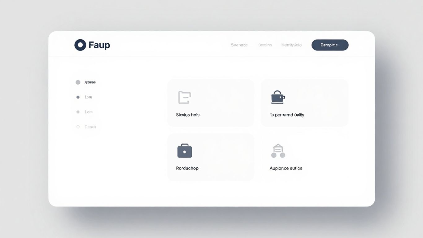
We're talking about whitespace, or negative space, here. It’s that empty area around text, images, and buttons. For a long time, designers felt the need to fill every single pixel. But that just leads to overwhelm. Generous whitespace actually makes content easier to read. It gives your eyes a place to rest. It also helps separate different sections of a page, so users can quickly understand what's what. High-end brands have known this for ages – think Apple or luxury fashion sites. They use tons of empty space to feel calm and sophisticated. Don't be scared of the blank areas; use them on purpose to guide people's eyes and let your design elements breathe.
Reducing Cognitive Load Through Simplicity
Our brains can only handle so much information at once. When a website is packed with too much stuff – too many colors, too many fonts, too many buttons – it's exhausting. This is called cognitive load. Simple, minimalist designs cut down on this. By removing unnecessary elements and focusing on what's important, we make it easier for users to process information quickly. It's about getting straight to the point without distractions. A good example is a simple app where you just tap what you want and it happens, no confusing menus or extra steps. That's good UX, plain and simple.
Creating Elegance and Sophistication with Negative Space
There's a certain elegance that comes with simplicity. When a design isn't fighting for attention with loud colors or busy patterns, it naturally feels more refined. Negative space plays a huge role in this. It creates a sense of calm and order. It makes the elements that are there stand out more. This approach projects a feeling of quality and thoughtfulness. It’s the digital equivalent of a perfectly tailored suit – clean lines, quality materials, and nothing extra. It just feels better to look at and interact with.
Strategic Use of Visuals and Interactive Elements
Leveraging Imagery and Iconography as Visual Shortcuts
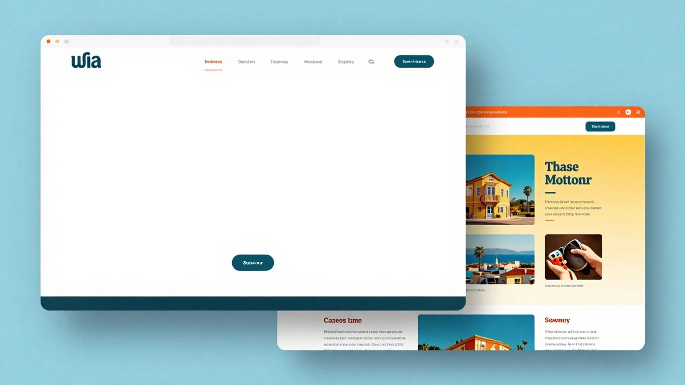
Think about how quickly you process information when you see a familiar icon. That little house usually means "home," right? That's the power of good icons. They act like visual shortcuts, letting users understand options without reading a lot of text. In 2026, we're seeing a continued push for high-quality, relevant images and illustrations that actually add to the message, not just fill space. Forget those cheesy stock photos; authentic visuals that connect with your audience are where it's at. When it comes to icons, consistency is key. They should all have the same style and weight so they feel like part of a cohesive set. This makes interfaces feel more intuitive and less cluttered.
Designing Intuitive and Responsive Interactive Components
These are the bits users actually click, tap, and swipe. Buttons, forms, navigation menus – they're the building blocks of any digital experience. The trick is making them work smoothly and predictably. We're talking about how a button looks when you hover over it, what happens right after you click it, and how a form tells you if you messed something up, ideally before you even submit it. Responsive design means these elements adapt to whatever screen size you're using, from your phone to your desktop. It's about making sure that clicking a button feels good and that forms are easy to fill out, with clear feedback every step of the way.
Ensuring Accessibility Through Color Contrast
This is a big one, and honestly, it should be non-negotiable. Not everyone sees colors the same way, and many people use screens in bright sunlight. That's why making sure there's enough contrast between your text and its background is so important. It's not just about making things look pretty; it's about making sure everyone can actually read and use your website or app. Using tools to check your color contrast against guidelines like WCAG is a must. It means your design works for more people, plain and simple.
Good design isn't just about aesthetics; it's about usability for everyone. When we prioritize things like clear visual cues and accessible color choices, we create digital products that are not only more pleasant to use but also more effective for a wider audience. It's about building digital spaces that welcome all users, regardless of their abilities or the environment they're in.
Here's a quick rundown of what to keep in mind:
- Visual Hierarchy: Use size, color, and placement to guide the user's eye. What's most important should stand out.
- Icon Consistency: Ensure all icons share a similar style and weight.
- Color Contrast: Always check that text is readable against its background, especially for users with visual impairments.
- Feedback Loops: Make sure users know their actions have been registered, whether it's a button changing state or a confirmation message.
The Rise of Organic and Asymmetrical Layouts
Forget those rigid grids that have been dictating web design for years. In 2026, we're seeing a big shift towards layouts that feel more natural, more human. This means embracing asymmetry and organic shapes, moving away from the predictable columns and rows we've all gotten used to.
Moving Beyond Traditional Grid Systems
Traditional grids are great for order, but they can sometimes feel a bit sterile. The new wave of design is all about breaking free from those strict boundaries. Think about mixing shapes, adjusting spacing, and playing with positions to create compositions that feel more dynamic and less like a spreadsheet. It's about letting the content breathe and guiding the user's eye in a more fluid way. This approach can make a website feel more alive and engaging, offering a fresh take on user experience.
The Psychology Behind Handmade Aesthetics
Why this move towards less structured designs? There's a real psychological pull. As more and more digital interfaces are churned out by algorithms, people are naturally drawn to designs that feel like they have a human touch. Organic shapes, soft gradients that mimic natural light, and asymmetrical arrangements all tap into this desire for something more authentic. It’s like the difference between a mass-produced item and something handcrafted – one feels more personal and relatable.
Creating Dynamic Compositions with Varied Spacing
This isn't just about looking different; it's about creating a more engaging visual experience. By varying spacing and using unconventional alignments, designers can create a sense of depth and movement. It allows for a more expressive hierarchy, where elements are emphasized not just by size, but by their placement and relationship to other components. This can lead to a more intuitive understanding of information, making the overall user experience more pleasant and memorable. It’s a way to make a website stand out and feel truly unique.
Nostalgia and Authenticity in Web Design
Remember the early days of the internet? The wild west of GeoCities, the chunky pixels, the blinking text? Well, it's back, sort of. In 2026, we're seeing a real push towards designs that feel more human and less corporate. It's like a collective sigh of relief from the sterile perfection that's dominated for years.
Retro Web Aesthetics and Early Internet Styles
This isn't about making websites look bad again, but rather cherry-picking the charming bits. Think asymmetrical layouts that feel a bit more playful, typography that has some character, and textures that add a bit of grit. It's a way to stand out, to show that there's a real person or team behind the screen. We're talking about bringing back some of that DIY spirit that made the early web so interesting.
Incorporating Y2K and DIY Vibes Authentically
This trend is especially popular with younger audiences who might be discovering these styles for the first time, or older users who remember them fondly. It’s about tapping into that feeling of early 2000s internet culture – the bright colors, the slightly chaotic energy, the sense of personal expression. But the key word here is authentically. You don't want to just slap on some glitter and call it a day. It needs to feel genuine to your brand. Maybe it's a subtle nod in your color palette, or a more overt use of playful graphics. The goal is to create something memorable and personal.
Expressing Personality Through Design Choices
Ultimately, this is what it's all about. In a world that can feel increasingly automated, users crave connection. They want to feel like they're interacting with something real. By embracing these retro and DIY elements, you're not just making a website; you're telling a story. You're showing off your brand's personality, its history, and its quirks. It's a way to break free from the cookie-cutter designs and create an online space that truly feels like you. It’s about making choices that feel intentional, not just following a trend for the sake of it.
Here's a quick look at how different elements can be brought back:
- Typography: Chunky fonts, handwritten styles, or even slightly pixelated text.
- Color Palettes: Brighter, bolder colors, or muted, earthy tones reminiscent of older operating systems.
- Layouts: Asymmetrical arrangements, visible grid structures, or elements that feel slightly off-kilter.
- Graphics: Pixel art, low-poly 3D models, or textured backgrounds.
The trick is to blend these nostalgic elements with modern usability. You want people to feel that warm fuzzy feeling of the past, but still be able to find what they need without a struggle. It's a balancing act, for sure.
Subtle Enhancements for Deeper Engagement
The Role of Sound as an Interface Element
Sound is quietly becoming part of the design system in 2026. Not in the form of autoplay music or noisy effects, but as small, intentional audio cues that support interaction. A soft click when a toggle switches. A muted whoosh when a task completes. Or a short tone that confirms when you perform an action. This shift is happening because interfaces are visually saturated. Motion, color, and layout are already doing a lot of work. Sound adds a second channel for feedback, one that reaches users instantly, even when they’re not looking directly at the screen. A great example is Santiago Franco’s UX/UI portfolio. As you scroll, the interface emits a light, almost watery bubble sound. When you click, you hear a short, crisp “tick,” similar to the sound of a light switching on. These subtle sounds do a great job of reinforcing user interactions, turning scroll and click into tactile moments.
Micro-interactions That Provide Delight and Feedback
One of the quieter shifts happening in 2026 is the return of small moments that feel good. Or as people often call them, micro-interactions. Think of a button that settles with a gentle bounce or a toggle that feels tactile when it switches. The psychology behind this is straightforward: when the interface acknowledges your input instantly and gracefully, your brain interprets it as competence. This immediate feedback reduces uncertainty, lowers cognitive effort, and creates small bursts of positive emotion that boost user engagement. You feel taken care of, even if you can’t pinpoint why. You’ll notice this pattern everywhere, as X, Duolingo, Slack, Instagram, and even Apple’s own native apps adopt it. The Transit app, for example, uses tiny interactive animations everywhere. The countdown around your next bus pulses, and the bus glides across the map, showing how it's approaching. Waiting suddenly doesn’t feel boring anymore; it’s giving your brain an enjoyable user experience while you wait.
Light Skeuomorphism for Tactile Cues
This is basically skeuomorphism making its way back in a light version. Instead of heavy textures or literal materials, it uses soft shadows, delicate gradients, lightly raised surfaces, and restrained embossing to suggest depth. In practice, it's a pressable-looking button or a toggle that looks grabbable. You’ll get the most value using this approach on components that benefit from tactile cues: primary buttons, toggles, sliders, and cards. For instance, Lemni applies a soft shadow effect only to the upgrade CTA and resource cards at the bottom of the sidebar. The elevation draws your eye down and makes those sections feel visible in the bottom places where information can easily get missed.
| Component Type | Tactile Cue Example |
|---|---|
| Buttons | Soft shadow, slight emboss |
| Toggles | Raised appearance, subtle gradient |
| Cards | Light elevation, soft border |
| Sliders | Grabbable handle appearance |
Prioritizing Clarity and Consistency
In the fast-paced digital world of 2026, making things easy to understand and predictable is more important than ever. Users don't have a lot of patience for confusing websites or apps. When a design is clear and consistent, people feel more comfortable and in control. It's like walking into a familiar room – you know where things are without having to think too hard.
The Clarity Imperative in Digital Design
Think about it: nobody wants to play a guessing game when they're trying to find information or buy something online. The main goal should always be to make the user's experience as straightforward as possible. This means cutting out anything that doesn't serve a clear purpose. If an option or a piece of text just adds noise, it's probably best to remove it. Less really is more here, leading to a calmer, more focused interaction.
Users should never have to stop and wonder what to do next. The mental effort required to use a digital product should be kept as low as possible. This isn't about dumbing things down; it's about smart design that respects people's time and attention.
Maintaining Internal and External Consistency
Consistency is the backbone of a trustworthy interface. When elements look and behave the same way throughout a site or app, users build familiarity. This internal consistency means using the same button styles, colors, and wording everywhere. It’s about creating a unified experience.
Beyond your own site, there's external consistency. This means following common web conventions. Users expect certain things from things like navigation menus or form fields because they've seen them elsewhere. Deviating from these norms without a very good reason can cause confusion. It’s generally better to stick to what people already know.
Here’s a quick look at what consistency helps with:
- Builds Trust: Predictable interfaces feel more reliable.
- Reduces Learning Curve: Users don't have to learn new ways of doing things.
- Improves Efficiency: Tasks can be completed faster when the path is clear.
- Creates Professionalism: A consistent look signals a well-maintained product.
Guiding User Attention with Visual Hierarchy
Visual hierarchy is all about directing the user's eye. It's how you show what's most important on a page. You can do this in a few ways:
- Size: Bigger text for headlines naturally draws attention.
- Color & Contrast: Using a bright, contrasting color for a call-to-action button makes it stand out.
- Placement: Putting key information where people naturally look first, like the top-left of a page, helps guide them.
By arranging elements thoughtfully, you create a clear path for the user, making sure they see the most important information first, then secondary details. It’s like telling a story with your layout.
Keeping things clear and the same is super important. When your website is easy to understand and looks the same everywhere, people trust it more. This helps them find what they need and makes them want to stick around. Want to make your site shine with clear and consistent design? Visit our website today to learn how we can help!
Wrapping It Up: Less Is More, Always
So, as we look ahead to 2026, it's pretty clear that the days of overwhelming, cluttered interfaces are numbered. People just want things to work, and they want to find what they need without a scavenger hunt. Clean layouts, smart use of space, and clear paths to action aren't just pretty trends; they're what make websites and apps actually usable. Think about it – when was the last time you stuck around on a site that felt like a digital junk drawer? Probably never. Focusing on simplicity and making things easy to understand is the way forward. It's not about being boring; it's about being effective and respecting the user's time. That's the real win.
Frequently Asked Questions
Why are clean web layouts better than cluttered ones?
Clean layouts make it easier for people to find what they need. When a website isn’t crowded with too many things, your eyes can rest and focus on what’s important. This helps users feel less stressed and makes the site more enjoyable to use.
How does white space help in web design?
White space, or empty space between elements, gives everything room to breathe. It makes reading easier, keeps things from looking messy, and helps guide your attention to the main parts of the website.
What are micro-interactions and why do they matter?
Micro-interactions are small animations or sounds that happen when you do something, like clicking a button or finishing a task. These little touches let you know your action worked and can make using a site feel more fun and friendly.
How do modern websites stay easy to use for everyone?
Modern sites use things like strong color contrast, simple icons, and clear buttons to make sure everyone—including people with vision problems—can use them. Designers also test their sites on different devices to make sure they work well everywhere.
What is the trend of using retro or handmade styles in web design?
Some websites now use styles that look like old computer screens or scrapbooks. This makes sites feel unique and personal, instead of looking like every other website. It’s a way to show personality and connect with people’s memories.
Why is consistency important in web design?
Consistency means using the same colors, buttons, and fonts throughout a website. This helps users know what to expect and makes the site feel more trustworthy and easy to use. When things look and work the same way everywhere, people don’t get confused.


Comments
Post a Comment