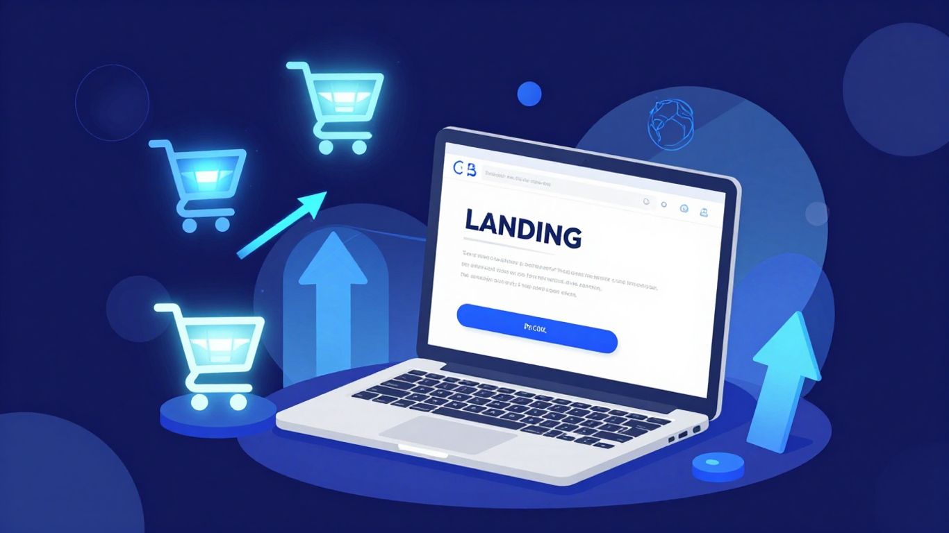
How Businesses Use Landing Pages for Web Marketing Success in 2026
In 2026, businesses are still finding that landing pages are a pretty big deal for getting people to actually do something online. It's not just about having a website; it's about having specific pages designed to get a visitor to click that button, fill out that form, or make that purchase. We're going to look at how companies are getting this right, from how they design the pages to the tech they're using. It’s all about turning those clicks into customers.
Key Takeaways
- Having more landing pages generally leads to more conversions, with a significant jump seen when going from 10 to over 40 pages.
- Mobile optimization is no longer optional; a large majority of top-performing landing pages are designed for mobile, and mobile traffic accounts for most landing page visits.
- Page speed and design are directly linked to conversion rates, meaning pages need to look good and load fast, especially on mobile devices.
- Newer tech like AI-generated pages and low-code tools are speeding up creation and showing promise for higher conversion rates.
- Focusing on a single offer per page, personalizing calls-to-action, and keeping forms short are proven ways to get more people to convert.
Maximizing Conversions Through Strategic Landing Page Design
So, you've got traffic heading to your website, which is great! But are they actually doing what you want them to do? That's where smart landing page design comes in. It's not just about looking pretty; it's about guiding visitors smoothly towards a specific goal, like signing up for a newsletter or grabbing a free guide. A well-designed landing page acts like a helpful guide, making it super easy for people to take that next step.
Crafting Benefit-Focused Headlines and Subheadlines
Your headline is the first thing people see, so it needs to grab their attention and tell them exactly what's in it for them. Forget generic phrases; focus on the benefit your offer provides. Think about what problem your visitor has and how your product or service solves it. A strong headline should be clear, concise, and speak directly to your target audience's needs.
- Agitate a pain point: Highlight a problem your audience faces.
- Promise a solution: Show how you can fix that problem.
- Hook them: Use a surprising statistic, a quick story, or a clever phrase.
Designing Visually Appealing and Engaging Layouts
People are visual creatures, right? A cluttered or boring page will make visitors click away faster than you can say "bounce rate." Aim for a clean, organized layout that's easy on the eyes. Use high-quality images or videos that support your message, but don't overdo it. White space is your friend; it helps break up text and makes the important stuff stand out. Think about how the page flows – does it naturally lead the eye down towards your call to action?
A visually appealing page doesn't just look good; it builds trust and makes visitors feel more comfortable engaging with your brand. It shows you care about their experience.
Leveraging Social Proof and Testimonials for Trust
Nobody likes buying from a stranger. Social proof is all about showing potential customers that other people trust and like your business. This can come in many forms:
- Customer testimonials: Real quotes from happy customers.
- Star ratings: Simple visual indicators of satisfaction.
- Case studies: In-depth stories of how you helped others.
- Trust badges: Logos of well-known clients or security certifications.
These elements help reduce uncertainty and build confidence, making visitors more likely to convert. Showing that others have had a positive experience can be a huge motivator for new visitors. For instance, seeing that a company like Leadfeeder uses testimonials effectively can encourage others to do the same.
The Crucial Role of Mobile Optimization in Landing Page Success
Let's face it, most people are browsing the web on their phones these days. If your landing page looks like a jumbled mess or takes forever to load on a smartphone, you're basically telling potential customers to go somewhere else. It's not just about looking good; it's about making it easy for people to do what you want them to do, right there and then, on whatever device they're using.
Understanding Mobile Market Share and User Behavior
It's pretty wild when you look at the numbers. By the end of 2025, mobile devices accounted for over 54% of all web traffic. That's more than half! Desktop is still important, sure, but you can't afford to ignore the mobile crowd. People on their phones are often on the go, maybe waiting in line or commuting. They want information fast and easy. If your page isn't built with them in mind, they're not sticking around.
Here's a quick look at the device split:
| Device | Market Share (Dec 2025) |
|---|---|
| Mobile | 54.23% |
| Desktop | 45.77% |
Implementing Mobile-First Design Principles
So, what does "mobile-first" actually mean? It means you design for the smallest screen first and then scale up. Think about it: what's the absolute minimum information someone needs to see to take action? Keep your text short, use clear buttons that are easy to tap, and make sure images aren't too huge. It's about stripping away the clutter and focusing on what matters most. This approach helps make sure your page looks good and works well on any device, not just phones.
- Keep text concise and easy to scan.
- Use large, tappable buttons for calls-to-action.
- Ensure navigation is simple and intuitive.
- Prioritize key information above the fold.
Designing for mobile first isn't just a trend; it's a necessity. It forces you to be disciplined about what you include on the page, cutting out anything that doesn't directly contribute to the conversion goal. This focus benefits all users, regardless of their device.
Ensuring Fast Load Times for Mobile Visitors
Nobody likes waiting. For mobile users, especially, slow load times are a conversion killer. If your page takes more than a few seconds to pop up, people will bounce. We're talking about optimizing images, using efficient code, and maybe even looking into a Content Delivery Network (CDN) if you have a lot of international visitors. Aiming for a load time under 2.4 seconds is a good target. It makes a real difference; studies show pages that load faster convert significantly better.
Leveraging Data and Analytics for Landing Page Improvement

So, you've built a landing page. Great! But how do you know if it's actually doing its job? This is where data and analytics come in. They're not just for tech giants; they're for anyone who wants their landing pages to work harder.
Utilizing Analytics for Crucial Strategy Insights
Think of analytics as your page's doctor. It tells you what's working and, more importantly, what's not. You can see where people are coming from, what they do on your page, and where they drop off. This information is gold for figuring out your next steps. For instance, if you see a lot of traffic from a specific ad campaign but very few conversions, something's off with that page for that audience. It's about getting real insights, not just guessing. Many marketers find that analytics provide the information needed to adjust their strategy, with 67% reporting this benefit.
Tracking Scroll Depth for User Engagement Analysis
Scrolling is a big deal. If people aren't scrolling, they're probably not seeing your main offer or call to action. Tracking how far down your page visitors go gives you a clear picture of their engagement. Are they stopping halfway through your main pitch? Maybe your content isn't holding their attention, or perhaps the important stuff is too far down. This kind of detail helps you rearrange content or make sure key elements are visible earlier.
Identifying Companies Visiting Landing Pages
Knowing who is visiting your landing page can be a game-changer, especially for B2B businesses. Tools exist that can identify the companies browsing your site, even if they don't fill out a form. This allows you to understand which types of businesses are showing interest. You can then tailor your follow-up or even your page content to better match their needs. It's a way to add a layer of personalization and focus your sales efforts more effectively.
The real win with data isn't just seeing numbers; it's about translating those numbers into actionable changes. A page that looks good but doesn't convert is just digital decoration. Analytics help you move from decoration to a conversion machine. Focus on what the data tells you about user behavior and adjust accordingly.
Here's a quick look at what to monitor:
- Conversion Rate: The most obvious metric. Are people taking the desired action?
- Bounce Rate: How many people leave after viewing only one page?
- Time on Page: How long are visitors staying? Are they engaged?
- Traffic Sources: Where are your visitors coming from? Are certain channels performing better?
- Scroll Depth: How far down the page do users go?
If you're just starting out and don't have a ton of traffic, don't get bogged down in complex testing. Focus on the basics first: make your headlines clear, shorten your forms, and ensure your page loads quickly. These foundational steps often provide the biggest wins. For businesses looking to improve their online visibility, understanding SEO is also a key part of the overall strategy.
Emerging Technologies Shaping Landing Page Creation
The way we build landing pages is changing, and fast. It's not just about slapping some text and a button on a page anymore. New tech is making things quicker and, honestly, a lot smarter.
The Impact of AI-Generated Landing Pages
Artificial intelligence is starting to write its own copy and even design layouts for landing pages. Early reports show that AI-generated pages can convert better than ones written by humans. Think about it: AI can analyze tons of data to figure out what words and designs work best for specific audiences. This means you might get a page that's already tuned for conversions without you having to guess. It's a big shift from the old way of doing things, where you'd spend hours tweaking headlines.
Accelerating Page Creation with Low-Code Tools
If you're not a coder, or even if you are but just want to move faster, low-code tools are a game-changer. These platforms let you build pages using visual interfaces, often with drag-and-drop features. Some tools can cut down the time it takes to get a page live by as much as 90%. This speed means you can test more ideas and get your marketing campaigns out the door quicker. It's about getting more done with less technical hassle, which is great for web design for startups.
Exploring the Growing Landing Page Software Market
There are a lot of companies making software specifically for landing pages now. The market is growing, and it's expected to be worth billions soon. This means more options for businesses, from simple builders to more complex platforms. You can find tools that help with everything from design to analytics, all aimed at making your landing pages work harder for you.
Here's a quick look at what's happening:
- AI Integration: Pages designed or written by AI are showing higher conversion rates.
- Low-Code Platforms: These tools drastically reduce the time needed to build pages.
- Market Growth: The software market for landing page creation is expanding rapidly.
The focus is shifting towards speed, intelligence, and ease of use. Businesses that adopt these new technologies can expect to see faster campaign launches and potentially better results from their online marketing efforts.
It's pretty wild how much things have changed even in the last couple of years. What used to take a whole team and weeks of work can now be done much faster, often with better results. It's definitely worth looking into these new tools if you want to stay ahead.
Optimizing Landing Page Elements for Higher Performance
So, you've got your landing page up and running. That's great! But are you getting the most out of it? Probably not, unless you've really dug into the details. It's not just about having a page; it's about making every single part of that page work as hard as possible for you. Think of it like tuning up a car – you can drive it as is, but a few tweaks can make it perform way better.
The Power of Personalized Calls-to-Action
Let's talk about the Call-to-Action, or CTA. This is the button or link that tells people what to do next, like "Sign Up Now" or "Download Your Free Guide." If your CTA is generic, it's like shouting into a crowd hoping someone specific hears you. Personalizing your CTAs makes them way more effective. Instead of a bland "Click Here," try something like "Get Your Personalized Plan" or "Start Your Free Trial Today." When the visitor sees something that speaks directly to their needs or interests, they're much more likely to click. It shows you understand them.
Here's a quick look at how personalization can help:
| Feature | Generic CTA Conversion Rate | Personalized CTA Conversion Rate |
|---|---|---|
| Example Offer | 12% | 15.84% |
This might seem like a small jump, but over time and with lots of visitors, it adds up. Make sure your CTA is also easy to spot – good contrast, clear text, and placed where people can see it without scrolling too much.
Streamlining Forms for Better Conversion Rates
Forms are necessary for collecting information, but they can also be a major roadblock. Every extra field you add is another reason for someone to hesitate or just leave. Think about it: do you really need their company size, their favorite color, and their mother's maiden name right away? Probably not.
- Keep it short: Aim for four fields or fewer. This is a sweet spot that balances getting enough info with not overwhelming the user. A page with only four form fields can see conversion rates jump significantly compared to pages with many more.
- Ask only what's needed: If you're offering a free guide, you likely just need an email address. If it's a demo request, maybe name and email are enough to start.
- Clear labels: Make sure each field is clearly labeled so people know exactly what you're asking for.
Reducing form friction is key. Visitors are often on your page for a specific, quick task. Complicating that task with a lengthy form is a sure way to lose them. Focus on the absolute minimum required to move them to the next stage of your sales funnel.
Focusing on Single Offers for Clarity
This is a big one. If your landing page is trying to get people to do five different things – sign up for a webinar, download an ebook, request a demo, subscribe to a newsletter, and buy a product – you're going to confuse them. They won't know what's most important, and they'll likely end up doing nothing at all. It's better to have one clear goal for each landing page. This makes your message sharp and your call-to-action obvious. For instance, a page dedicated solely to signing up for a free trial will perform much better than a page that tries to push multiple offers. Data shows that concentrating on a single offer can dramatically increase your conversion rate, sometimes by over 200% compared to pages with multiple offers. This focused approach helps build trust and makes it easier for visitors to take the desired action, contributing to a more consistent brand presence across your marketing efforts.
The Strategic Advantage of Multiple Landing Pages
Think about it: sending everyone who clicks an ad to the exact same page is like trying to have one conversation that satisfies a whole room of people. It just doesn't work, right? That's where having multiple landing pages really shines. Instead of one generic page, you create several, each designed for a specific purpose or audience. This approach means you're not just casting a wide net; you're casting multiple, perfectly baited nets.
Increasing Conversions with a Higher Page Count
It might sound counterintuitive, but having more landing pages often leads to more conversions. Why? Because each page can be super focused. If you have, say, 31 to 40 landing pages, you're likely to see about seven times more leads than if you only have one to five. It’s about giving people exactly what they expect when they click. A visitor coming from a Google search about "organic dog food" should land on a page talking all about organic dog food, not a general page about all pet supplies. This specificity cuts down on confusion and makes it easier for people to take the next step.
Tailoring Messaging for Specific Audience Segments
People are different, and they respond to different things. You wouldn't talk to your grandma the same way you'd talk to your best friend, would you? The same applies to marketing. If you're targeting busy parents, you'll want to highlight convenience and time-saving benefits. If you're aiming at tech enthusiasts, you might focus on innovative features and specs. Creating separate landing pages allows you to craft messages that really hit home with each specific group. This targeted approach makes your marketing feel more personal and relevant, which naturally boosts engagement and conversions. It's about speaking their language.
Using Dedicated Pages for Distinct Campaigns
Imagine running a big sale on one product and also trying to get people to sign up for a free webinar. Trying to cram both messages onto one landing page is a recipe for disaster. Visitors get confused about what you want them to do. With multiple landing pages, you can dedicate one page entirely to the sale, with a clear call to action like "Shop Now." Another page can focus solely on the webinar, with a "Register Today" button. This clarity is key. It means each campaign has its own spotlight, making it easier for visitors to understand the offer and act on it. This focused strategy helps you track campaign performance more accurately too, so you know what's working and what's not.
When you create multiple landing pages, you're essentially building custom pathways for different types of visitors. Each page is designed to meet the specific needs and expectations of a particular segment of your audience or a distinct marketing effort. This focused approach reduces friction, increases relevance, and ultimately guides more people toward becoming customers.
Here's a quick look at how page count can impact lead generation:
| Number of Landing Pages | Relative Lead Generation | Example Scenario |
|---|---|---|
| 1-5 | Baseline | Generic product page |
| 31-40 | 7x Higher | Multiple niche offers |
| 40+ | Significantly Higher | Highly segmented campaigns |
This strategy is all about making things easier for the person visiting your page. By giving them a clear, relevant experience, you make it much more likely they'll do what you want them to do. It's a smart way to get better results from your online marketing efforts, especially when you're trying to get noticed across different platforms like search engines and social media search everywhere.
Choosing the Right Tools: Top Website Builders for Landing Pages
So, you've got your strategy down, you know what you want to say, and you're ready to build. But where do you actually make these landing pages? You don't have to be a coding wizard these days. There are tons of website builders out there designed specifically to make this process way easier. Think of them as your digital construction crew.
Evaluating Popular Landing Page Builder Options
When you start looking around, you'll see a lot of names. Some are super popular for a reason. Take Leadpages, for instance. It's pretty beginner-friendly and can get you up and running fast. They offer hosting, which is handy if you don't want to mess with your main website's setup. Then there's HubSpot, which is like a whole marketing suite in one. Its landing page tool is just one piece of the puzzle, but it's pretty robust, letting you personalize pages based on who's visiting. Unbounce is another big player, really focused on turning visitors into customers. They also have drag-and-drop tools and good analytics to see what's working.
It's not just about picking the flashiest one. You need to think about what you actually need. Do you want something super simple, or do you need all the bells and whistles like advanced personalization and CRM integration? Here's a quick look at what some offer:
| Builder | Ease of Use | Key Features | Best For |
|---|---|---|---|
| Leadpages | High | Drag-and-drop, hosting, templates | Beginners, quick setup |
| HubSpot | Medium | Drag-and-drop, personalization, CRM integration | All-in-one marketing needs |
| Unbounce | Medium | Drag-and-drop, A/B testing, pop-ups/bars | Conversion optimization, lead generation |
Utilizing Templates for Efficient Design
Honestly, staring at a blank page is intimidating. That's where templates come in. Most builders offer a library of pre-designed landing pages. These aren't just random designs; they're often built with conversion in mind. You can find templates for different goals – like lead generation, product launches, or webinar sign-ups. Picking a good template saves you a ton of time and gives you a solid starting point. You can then tweak it to match your brand and message. It's way faster than starting from scratch, and you get a professional look without needing a designer.
Building a landing page doesn't have to be complicated. Using a builder with good templates means you can focus more on your message and less on the technical stuff. It's about getting your offer in front of people effectively.
Considering Website Builders for Comprehensive Needs
Sometimes, a dedicated landing page builder might feel a bit limited if you're also thinking about your main website. That's when you might look at broader website builders that also have strong landing page capabilities. Tools like these can be great if you want everything under one roof. You can manage your entire online presence – from your main site to your campaign-specific landing pages – all in one place. This can simplify things, especially when it comes to tracking and analytics. Plus, if you're already using a website builder for your main site, sticking with them for landing pages can mean better integration and a more consistent user experience across all your digital properties. It's worth checking out if they offer the specific features you need for landing pages, like A/B testing or advanced form options, to make sure they fit your marketing goals. For businesses looking to improve their overall online visibility, working with SEO providers can also be a smart move alongside your landing page efforts.
Picking the best tools for your landing pages is super important. We've checked out some awesome website builders that make creating great pages easy. Want to see which ones made our list? Check out our guide to the top website builders for landing pages and find the perfect fit for your project!
Wrapping Up: Why Landing Pages Still Matter in 2026
So, what's the big takeaway here? Landing pages are still a huge deal for getting people to actually do something online, whether that's signing up, buying, or just clicking. It's not just about having a page, though. The real win comes from making that page work as hard as possible. We've seen how important it is to make sure your pages load super fast, look good on phones, and have clear messages that tell people exactly what you want them to do. Plus, with tools getting smarter and faster, creating and testing different versions of your pages is easier than ever. If you're not paying attention to these details, you're likely leaving money on the table. Getting your landing pages right means more people take action, and that's good for business, plain and simple.
Frequently Asked Questions
What is a landing page and why do businesses use them?
A landing page is like a special web page made for a specific marketing or advertising campaign. Think of it as a single destination that's designed to get visitors to do one thing, like sign up for a free trial or buy a product. Businesses use them because they're super focused, which helps them get more people to take that desired action, leading to more sales or sign-ups.
How important is it for landing pages to work on phones?
It's incredibly important! Most people use their phones to browse the internet these days. If your landing page looks bad or is hard to use on a phone, people will leave right away. Making sure it works perfectly on mobile devices is key to getting them to stick around and take action.
What makes a landing page design good?
A good landing page has a clear and catchy headline that grabs attention right away. It also has a clean look, uses nice pictures or videos, and makes it super easy for visitors to understand what you're offering. Most importantly, it has a clear button or link telling them exactly what to do next, like 'Sign Up Now' or 'Learn More'.
Should I have just one landing page or many?
Having many landing pages is usually better! Each page can be made specifically for different groups of people or different ads. This means you can talk to each visitor in a way that makes the most sense to them, which helps get more of them to do what you want them to do.
How can I tell if my landing page is actually working well?
You can track how many people visit your landing page and how many of them actually do what you want them to do (like signing up). This is called tracking conversions. By looking at this information, you can see what's working and what's not, and then make changes to improve it.
Are there new tools that can help me make landing pages faster?
Yes, there are! New tools using artificial intelligence (AI) can help create landing pages for you, and other tools called 'low-code' builders let you put pages together quickly without needing to be a computer expert. These make it much faster and easier to get new landing pages up and running.


Comments
Post a Comment