The Invisible Art: Mastering the User Journey Through Subtle Design Choices

You know, sometimes the best design is the kind you don't even notice. It's like a well-placed signpost on a hike – it just helps you get where you're going without making a fuss. This is what we're talking about when we say 'The Invisible Art: How Subtle Design Choices Shape the User Journey.' It's all about making things work so smoothly that people don't even think about the design itself. They're just… using it. And enjoying it. We're going to look at how small touches, smart layouts, and a bit of empathy can make a huge difference in how someone experiences a product or website. It’s not about flashy features; it’s about making the whole experience feel natural and easy. Let's get into it.
Key Takeaways
- Really get to know the people you're designing for. Ask questions, watch them use things, and try to see things from their point of view. Personas and empathy maps can help with this.
- Don't show users everything all at once. Reveal information bit by bit as they need it. This keeps things clean and less overwhelming. Think about using space wisely, too.
- Guide people's eyes with clear visual cues. Use size, color, and where things are placed to show what's important and what they should look at next.
- Give users little signals that tell them what's happening. Small animations or messages after they do something can make the experience feel more complete and less like a black box.
- Keep things the same across your product. Using consistent colors, fonts, and buttons makes it predictable and easier for people to learn and use.
Understanding The User's Intent
Before you even think about picking colors or arranging buttons, you need to get inside your user's head. It sounds a bit creepy, but honestly, it's the most important part of making something people will actually want to use. If you're just guessing what people want, you're probably going to build something that misses the mark entirely. It's like trying to cook a meal for someone without knowing if they like spicy food or if they're even hungry.
Uncovering Mental Models Through Curiosity
Think about how people naturally approach tasks. What's their usual way of doing things? This is their mental model. You can find out by just asking 'why?' a lot. When someone does something on your prototype, don't just nod. Ask them why they clicked there, why they expected that to happen. It's about being genuinely curious about their thought process. This isn't about judging their actions, but understanding the assumptions they bring with them.
Creating Relatable Personas and Journey Maps
Once you've got a feel for how people think, give them a face. Create personas – fictional characters that represent your typical users. Give them names, jobs, goals, and even frustrations. Then, map out their journey. How do they get from needing something to using your product to solve it? What are the steps? Where do they get stuck? A good journey map will show you exactly where the pain points are, the moments where they might get frustrated or confused.
Leveraging Empathy Maps for Deeper Insight
An empathy map takes it a step further. It's not just about what users do, but what they think, feel, and say. This helps you connect with them on a more human level. You're trying to see the world from their perspective. What are their hopes? What are their fears related to the task they're trying to accomplish? This kind of insight helps you design not just a functional product, but one that feels right and makes sense to the person using it.
Understanding user intent isn't a one-time task. It's an ongoing process of observation and questioning that informs every design decision you make. It's the foundation upon which all good user experiences are built.
Here's a quick look at what you're trying to uncover:
- User Goals: What are they trying to achieve?
- User Motivations: Why do they want to achieve it?
- User Expectations: What do they think will happen?
- User Frustrations: What obstacles might they face?
- User Context: Where and when are they using this?
The Power of Progressive Disclosure
Ever felt overwhelmed by a website that throws everything at you all at once? Like walking into a store where every single item is piled high, with no clear path or organization? That's exactly what we're trying to avoid with progressive disclosure. It's all about showing users just enough information to get them started, and then letting them dig deeper if they want to. This approach makes complex interfaces feel much simpler and more approachable.
Think about it like peeling an onion. You start with the outer layer, and only as you need to, you reveal the next. This keeps things clean and prevents users from getting lost in a sea of options they might not even need.
Minimalism: Every Element Serves a Purpose
This isn't just about making things look pretty; it's about making them work better. Every button, every piece of text, every icon should have a clear reason for being there. If you can't easily explain why something is on the screen, it's probably best to take it off. This forces us to be really intentional with our design choices.
- Audit your interface: Regularly ask yourself, "Can this element be removed?" If the answer is yes, then delete it.
- Focus on core tasks: Prioritize the main things users want to accomplish and make those elements prominent.
- Eliminate redundancy: Avoid showing the same information or options in multiple places.
When we strip away the unnecessary, we create space for what truly matters. This clarity helps users focus on their goals without getting sidetracked by visual clutter.
Strategic Content Revelation
Instead of showing all the settings, filters, or advanced options right away, we hide them behind an "Advanced" button or a toggle. This is progressive disclosure in action. Users get the basic experience first, and if they need more, they can easily find it. It's like a well-organized toolbox – the most common tools are out front, but the specialized ones are still there when you need them.
Here’s a quick look at how different elements can be revealed:
| Element Type | Initial State | Revealed State (on user action) |
|---|---|---|
| Form Fields | Basic required | Advanced/optional fields |
| Navigation Menu | Primary links | Secondary/sub-menu items |
| Settings | Common preferences | All available configurations |
| Search Filters | Few key filters | All available filter options |
The Elegance of Whitespace
Whitespace, or negative space, is often misunderstood as just empty areas. But it's actually a powerful design tool. It gives elements room to breathe, making the interface feel less cramped and more organized. Good use of whitespace guides the eye and improves readability. It helps separate different sections of content, making it easier for users to scan and find what they're looking for. Think of it as the quiet space between musical notes – it's just as important as the notes themselves.
Guiding Attention with Visual Hierarchy
Think about how you scan a webpage. You don't read every word, right? You skim, you look for headings, bold text, and images. That's visual hierarchy in action. It's the art of arranging elements on a page to show their order of importance. When done right, it makes your interface feel intuitive, structured, and almost effortless to use. It’s like a silent guide, telling users where to look first, second, and so on.
Directing Eyeballs Through Size and Scale
Size is one of the most straightforward ways to signal importance. Larger elements naturally draw the eye. Think of a website's main headline – it's usually the biggest text on the page. Supporting text is smaller, and perhaps legal disclaimers are tiny, but still readable. This isn't just about aesthetics; it's about guiding the user's gaze through the content in a logical flow. Using a consistent type scale, like 12px for body text, 18px for subheadings, and 32px for main titles, creates a rhythm that makes scanning easier. It prevents the page from feeling like a jumbled mess of different font sizes.
Strategic Use of Color and Contrast
Color and contrast are powerful tools for directing attention. A bright, contrasting button against a muted background will almost always grab attention. This is why call-to-action buttons are often designed in vibrant colors. However, it's not just about making things pop. Contrast is also vital for accessibility. If the text color is too close to the background color, people with visual impairments, or even just those in bright sunlight, will struggle to read it. Aiming for a contrast ratio of at least 4.5:1 for body text, as recommended by WCAG guidelines, is a good practice. This ensures that important information is visible to everyone. You can use tools to check your contrast ratios before you launch.
Crafting a Clear Visual Pathway
Creating a clear visual pathway means arranging elements so that users can easily follow the intended flow of information or action. This involves more than just size and color; it includes alignment, proximity, and the strategic use of whitespace. Elements that are aligned and close together are perceived as related. This allows you to group information into digestible chunks. For instance, a form with its labels aligned neatly above the input fields creates a clear pathway for completion.
Here’s a quick breakdown of how to build that pathway:
- Alignment: Line up elements consistently. Left-aligned text is generally easier to read in blocks.
- Proximity: Group related items together. This helps users understand relationships between different pieces of information.
- Whitespace: Don't be afraid of empty space. It gives elements room to breathe and helps users focus on what's important. It prevents the feeling of being overwhelmed.
- Repetition: Using consistent styles for similar elements (like all buttons having the same shape and hover effect) reinforces their function and makes the interface predictable. This consistency is key to building trust and making your design feel polished. For more on how to keep your designs consistent, check out building trust through consistency.
Visual hierarchy isn't about making things look pretty; it's about making them understandable. It's the invisible structure that supports the user's journey, ensuring they can find what they need without getting lost or frustrated. When you prioritize clarity through thoughtful arrangement, you're not just designing an interface; you're designing an experience.
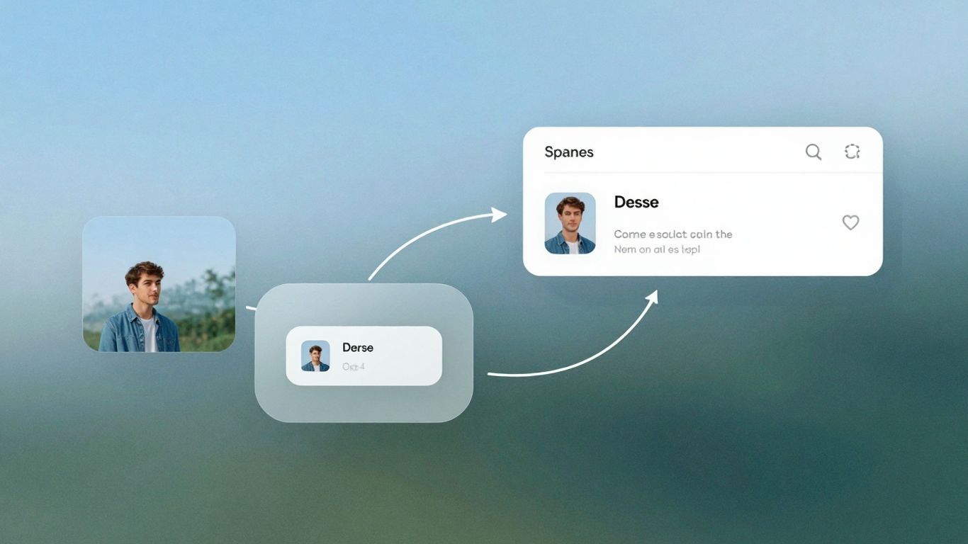
The Art of Subtle Feedback and Microinteractions
Think about the last time you tapped a button and… nothing happened. Did it work? Did it glitch? Did the digital ether just swallow your command? That feeling of uncertainty is a real drag on the user experience. Feedback is how we close that communication loop, letting users know their action was received and what to expect next. It’s your interface’s way of saying, "Got it, and here’s what’s up."
Delighting Users with Polite Nods
Microinteractions are those tiny, often animated, moments that acknowledge a user's action. They’re like a friendly nod or a quick thumbs-up. Did you just like a post? A little heart animation pulses. Did you successfully submit a form? A brief checkmark appears. These aren't just decorative; they provide immediate confirmation and can even add a touch of personality. The goal is to make these moments feel natural and helpful, not distracting. Think of them as the polite greetings of your UI. They can make a big difference in how a user perceives the responsiveness and polish of an application. For instance, a subtle animation on a button when clicked can signal that the system registered the input, preventing users from clicking multiple times out of confusion. This is a key part of creating a positive user experience.
Communicating System Status with Indicators
When your application is busy doing something in the background, it’s important to show it. Users are generally patient if they know something is happening. Loading indicators, whether they’re simple spinners, progress bars, or even skeleton screens that mimic the layout, help manage expectations. Instead of staring at a blank screen, users see that the system is working. Adding context to these indicators is even better. Instead of just a spinner, showing "Uploading file… 80%" provides much clearer information and reduces anxiety. This transparency builds trust and makes waiting feel less like a void.
Notifications and Alerts: Closing the Loop
Notifications and alerts are the more direct forms of feedback. They’re used to inform users about important events, successes, or errors. A success toast message after a purchase, or a clear error alert explaining why a login failed, are critical for guiding users. The key here is clarity and timeliness. Alerts should be informative without being alarming, and notifications should be relevant without being intrusive. They serve to close the loop on a user's task, confirming completion or providing necessary guidance for next steps. It’s about making sure the user always knows where they stand with the system.
Effective feedback mechanisms are not just about informing users; they're about building confidence and reducing cognitive load. When users don't have to guess if their actions registered or what the system is doing, they can focus on their actual goals.
Building Trust Through Consistency

Imagine walking into a house where every room looks completely different. One's modern, the next is old-fashioned, and another is some wild theme. It's jarring, right? Your website or app can feel the same way to users if it lacks consistency. Consistency is the bedrock of user trust and predictability. It’s what makes a product feel professional and easy to use, because users know what to expect. When things are consistent, people don't have to stop and think; they just know. This makes their experience feel smooth and comfortable.
Establishing a Unified Design Language
A unified design language is like the architectural style of your digital house. It means sticking to a specific set of rules for how things look and behave. This includes your typography and color scheme. You don't need a dozen fonts to seem creative; clarity is more important. Pick one or two typefaces that work well together and a color palette that fits your brand without being overwhelming. Think about using one main color, an accent color, and a few neutral tones. It’s about creating a cohesive visual identity that users can recognize and rely on.
Standardizing Components for Predictability
Think of a component library as your UI's recipe book. You design elements like buttons, input fields, and cards once, and then reuse them everywhere. This standardization means buttons always look and act the same, no matter where they appear. This predictability is a huge part of making a product feel intuitive. When users learn how a button works in one place, they can apply that knowledge everywhere else. This reduces the learning curve and makes the whole experience feel more effortless. It’s about making sure that when a user interacts with a component, the outcome is always what they anticipate. This is key for building lasting relationships with your customers building trust.
Leveraging Familiar Patterns for Ease of Use
Sometimes, the best way to design is to stick with what already works. Common UI patterns exist because they’ve proven effective over time. Users are already familiar with how navigation bars, search bars, and form layouts typically function. Trying to reinvent these basic elements can often lead to confusion. While innovation is good, it should serve a purpose. Don't move the navigation bar to the bottom just to be different if it makes it harder for users to find. Using these familiar patterns means users don't need a manual to figure out your interface. It’s about meeting users where they are and making their journey as straightforward as possible.
Iterative Design and User Validation
Building a great user experience isn't a one-and-done deal. It's more like tending a garden; you plant the seeds, watch them grow, and then you prune and water based on what you see. That's where iterative design and user validation come in. It’s about constantly checking in with your users and making adjustments. This cycle of building, testing, and refining is what truly separates good designs from ones that people actually love to use.
Observing Real Users Through Testing
Look, you can spend hours staring at your screen, tweaking pixels and debating font choices, but until real people interact with your design, you're just guessing. Usability testing is your secret weapon here. It’s not about finding fault; it’s about understanding how people actually use your product. You'll see where they get stuck, what confuses them, and what makes them smile. Even a small number of tests can reveal a surprising amount of issues.
- Watch and Learn: Set up simple tasks for users to complete. Don't guide them too much; let them figure it out.
- Ask "Why?": When a user hesitates or makes a mistake, gently ask them to explain their thought process.
- Note Everything: Keep a log of observed behaviors, comments, and any points of friction.
The goal isn't to prove your design is perfect from the start, but to find the rough edges so you can smooth them out before they become major problems for your audience.
Data-Driven Decisions with A/B Testing
Sometimes, you're faced with two (or more) pretty good options for a design element, like a button color or a headline. Instead of just picking the one you think is better, why not let the data decide? That's where A/B testing shines. You show one version to one group of users and another version to a different group, then you measure which one performs better against your goals – maybe it's more clicks, more sign-ups, or less confusion.
Here’s a quick look at how it works:
| Feature Tested | Version A | Version B | Metric | Winner |
|---|---|---|---|---|
| Button Text | "Learn More" | "Get Started" | Click-Through Rate | Version B |
| Signup Form Layout | Single Column | Two Columns | Completion Rate | Version A |
| Headline Copy | "New Features" | "What's Improved" | Bounce Rate | Version B |
Remember, it's best to test one change at a time. If you change the button color and the text, you won't know which one made the difference.
Analyzing Behavior with Analytics Tools
Beyond direct observation, analytics tools give you a bird's-eye view of how users are interacting with your live product. Tools like Google Analytics can tell you which pages are most popular, where users tend to drop off in a process, and how long they spend on different sections. It’s like having a constant stream of information about user behavior, helping you spot trends and identify areas that might need a closer look. You can set up custom events to track specific actions, like button clicks or form submissions, giving you more targeted insights than just general page views.
Integrating Emerging Trends Thoughtfully
So, the digital world keeps spinning, and new design ideas pop up faster than you can say "flat design." It's easy to get caught up in the shiny new things, but the trick is to use them wisely. We're talking about things like dark mode, neumorphism, and even voice controls. They can make an app feel modern and cool, but if you slap them on without thinking, they can actually make things harder for people to use.
Designing Effective Dark Mode Experiences
Dark mode isn't just a fad anymore; people expect it. It's easier on the eyes, especially at night, and can even save battery on certain screens. But it's not as simple as just inverting colors. You need to think about how text reads against dark backgrounds and make sure there's enough contrast. Treat dark mode as a full-fledged theme, not an afterthought. This means using smart color variables (like --background-primary instead of a specific hex code) so you can switch themes easily across your whole app. It takes a bit more upfront work, but it pays off big time.
Judicious Use of Neumorphism and Glassmorphism
Neumorphism, with its soft, extruded look, and glassmorphism, with its frosted-glass effect, are definitely eye-catching. They look amazing in design mockups, but using them in a real product can be tricky. The biggest challenge is often accessibility and contrast. It's easy for elements to blend together, making it hard for some users to tell what's clickable or even what's there.
- Contrast is King: Always ensure sufficient contrast between elements, especially text and interactive components. Use accessibility checkers.
- Sparingly is Best: These styles work best as accents, not as the primary look for everything. Think a single button or a card background.
- Test, Test, Test: Get real users to try it out. What looks good on a screen might be confusing in practice.
The goal is to add a touch of visual interest without sacrificing clarity or ease of use. If a trend makes your interface harder to understand, it's probably not the right fit.
Exploring Voice and Gesture Controls
Voice and gesture controls are becoming more common, especially with smart devices and wearables. They can be super convenient, letting people interact with apps hands-free or from a distance. But you can't just assume everyone will want to talk to their phone or wave their hands around. It's important to:
- Keep it Natural: Design voice commands that feel like normal conversation.
- Provide Alternatives: Always have a traditional touch or click option available. Not everyone is comfortable with voice or gesture.
- Test for Accuracy: Make sure the system understands different accents and background noises.
Thinking about these new ways people might interact with your product from the start, rather than trying to add them later, makes a big difference. It's about making your design work for more people in more situations.
Keeping up with new ideas is important for your business. We help you use the latest trends in a smart way to make your business stand out online. Want to see how we can help you get noticed? Visit our website today to learn more!
It's All About the Flow
So, we've talked a lot about how those little design choices, the ones you barely notice, really add up. It’s not about flashy stuff; it’s about making things feel right, like you already know how to use it without thinking. When design just works, it feels like magic, right? That's the goal. Keep paying attention to those small details, the timing, the little nudges. That's how you create experiences that people actually enjoy, without them even realizing why. It’s the invisible art, and it makes all the difference.
Frequently Asked Questions
What is "invisible design"?
Invisible design is like a helpful friend who only shows up when you need them. It's about making things easy to use without being obvious all the time. Think about how your phone suggests the next word you might type – it's there when you need it, but it doesn't get in your way when you don't.
Why is understanding the user so important?
Imagine trying to give directions to someone without knowing where they want to go. That's what designing without understanding users is like! Knowing what people need and expect helps you build things they'll actually like and find easy to use.
What does "progressive disclosure" mean in design?
It means not showing everything all at once. Instead, you show the most important stuff first, and then let people find more details if they want them. It's like opening a gift box – you see the main item first, then maybe some wrapping paper or a card inside.
How does "visual hierarchy" help users?
Visual hierarchy is like using a spotlight to show people what's most important on a screen. By making some things bigger, brighter, or bolder, you guide their eyes to the right places, making it easier to understand information quickly.
What are "microinteractions" and why do they matter?
Microinteractions are those tiny, little moments in an app that make it feel alive – like a button changing color when you press it, or a little animation when you get a new message. They give you feedback and make the experience feel more fun and less robotic.
Why is it important for a design to be consistent?
Consistency is like having the same rules everywhere. When a design looks and works the same way throughout an app or website, it feels familiar and predictable. This makes it much easier for people to learn and use without getting confused.


Comments
Post a Comment